
Showcase for a new mobile team: A free app exhibiting the world’s best photojournalism and curated creative photography
MY ROLE: Product design, Content strategy, UX Design (information architecture, usability testing, site mapping, prototyping), Interactive Design (interface design, visual design), Quality assurance testing
Having helped form a new multi-disciplinary mobile team at Getty Images, I worked closely with the lead developer (that I had brought to the team), the product director, and our UX researcher to create a new entertainment app that would be the flagship for Getty Images’ new consumer strategy and our new working relationship with Apple. This culminated in an appearance in an Apple Keynote address, many favorable reviews, two version releases and a template that would inform my Apple TV work and other projects across the company.
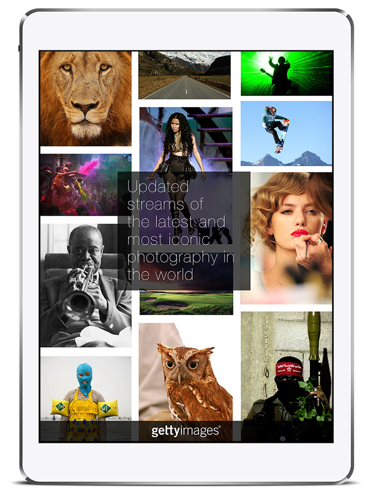
“Getty Images Stream is a new app for your iPhone® that is designed for personal use. Find images that captivate you – from your favorite athlete making a game-winning play, to everyday people swept up in world events, to what your favorite celebrity wore last night on the red carpet. See the world through the lens of Getty Images’ world-class photographers - from today's news told through crisp, compelling photos to historic moments in time captured forever in our image archives. Whether you’re passionate about news, sports, entertainment, history, or creative design, Stream has you covered. Download now to find and share our most inspiring, entertaining, and thought-provoking photos.
Search millions of beautiful photos from your device.
Save and favorite images that inspire you.
Get alerts when new photos are added to favorite categories.
Share photos and photo stories with followers and friends.”
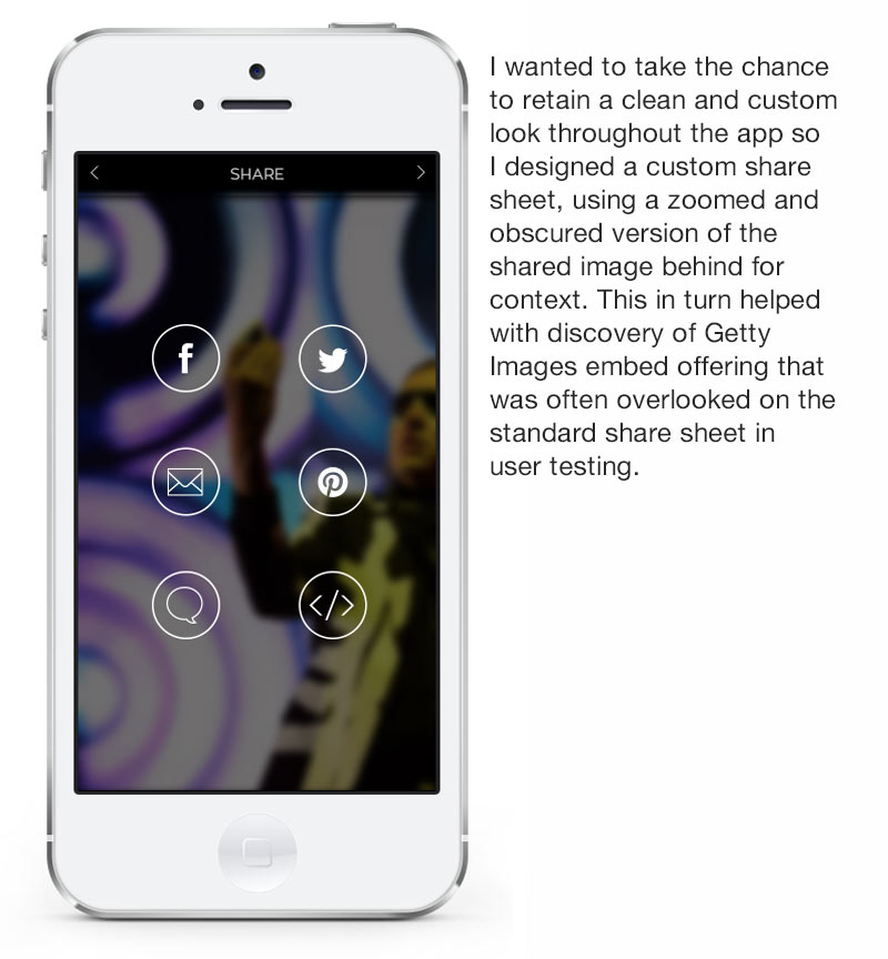
When Getty Images realized that a majority of the traffic to their website originated from image searches not related to commercial image licensing, their primary source of revenue, they began a consumer and brand strategy to focus on this audience. They released a new and well publicized Embed feature that allowed anyone to post photography from Getty Images collections on non-commercial websites or social media for free. Instead of having an obscuring watermark on the photos, they were presented in a simple branded frame with additional sharing options that I helped design. This focus on “Business to Everyone” and sharing and saving of content became the primary effort at Getty, prompting new energy invested in UX and design.
While at Apple’s Worldwide Developers Conference, the Manager of Application Development and another designer created a POC called “Tableau” that was the basic origin of the Stream app. At the same time, I was helping reconfigure visual explorations of the core licensing website by the POP agency into an animated presentation for a meeting between Getty and Apple executives. Both my presentation and the Tableau POC helped establish a working relationship between Getty and Apple and prompted the formation of a new multi-disciplinary mobile team at Getty Images headquarters. Due to my extensive background in mobile design and previous work on the early consumer feature “Celebrity Profiles” and the Embed feature, I was put in charge of the new Stream app while helping create a larger team to work on the core app and Android expansion.
Due to my work on an early consumer feature for Getty Images prior to forming the mobile team, I knew that getting the right content would be a key factor in delivering the best experience to users. In the very first strategy meeting with our Product Director, I explained the need to remove the repetitive images that were a working function of our Editorial content. When licensing an image, publishers look for slightly different angles, perspectives and orientations of events to fit their specific format and differentiate their content from competitors. This is vital for licensing but a major impediment for casual viewing.
Other factors also complicated the presentation of photos in a typical search or category grid that needed examination. I had spent a lot of time researching Getty’s multitude of different websites and channels that contained curated galleries and collections. They were an untapped but brilliant resource but the problem that we found was that none of these avenues of content were “plumbed” for our direct access. Working with contacts throughout the company, including the Search and API teams, the Product Director and I helped facilitate a custom recipe and new ingress rating system for Stream’s content. As testing occurred across Stream’s lifespan, quality assurance reviews would prompt various refinements to the process.
An array of launch icons
Disputes over the launch icon were ever present outside of our team. The marketing department in New York, executives in Seattle, and design management all had different ideas. The final (far right) icon was the last version and unlike the others that I designed, it was pulled from a loading graphic for the OSX version of Stream by another designer on our core app team.
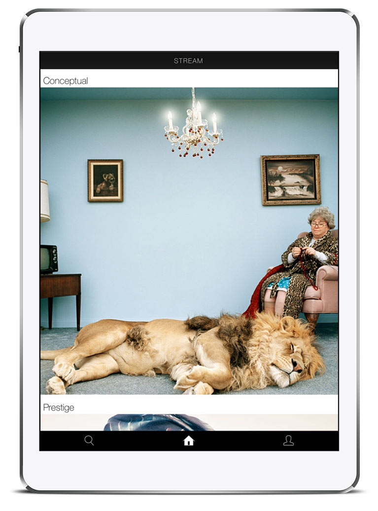
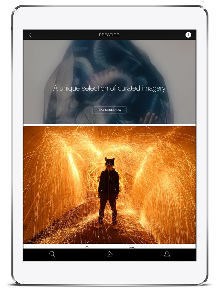
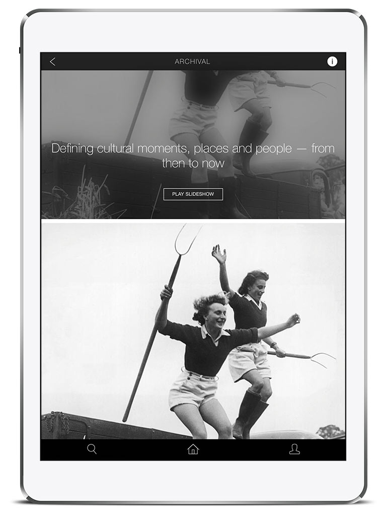
V1: Initial architecture
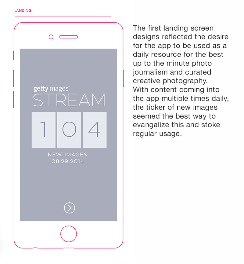
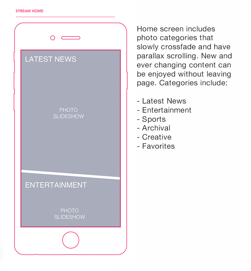
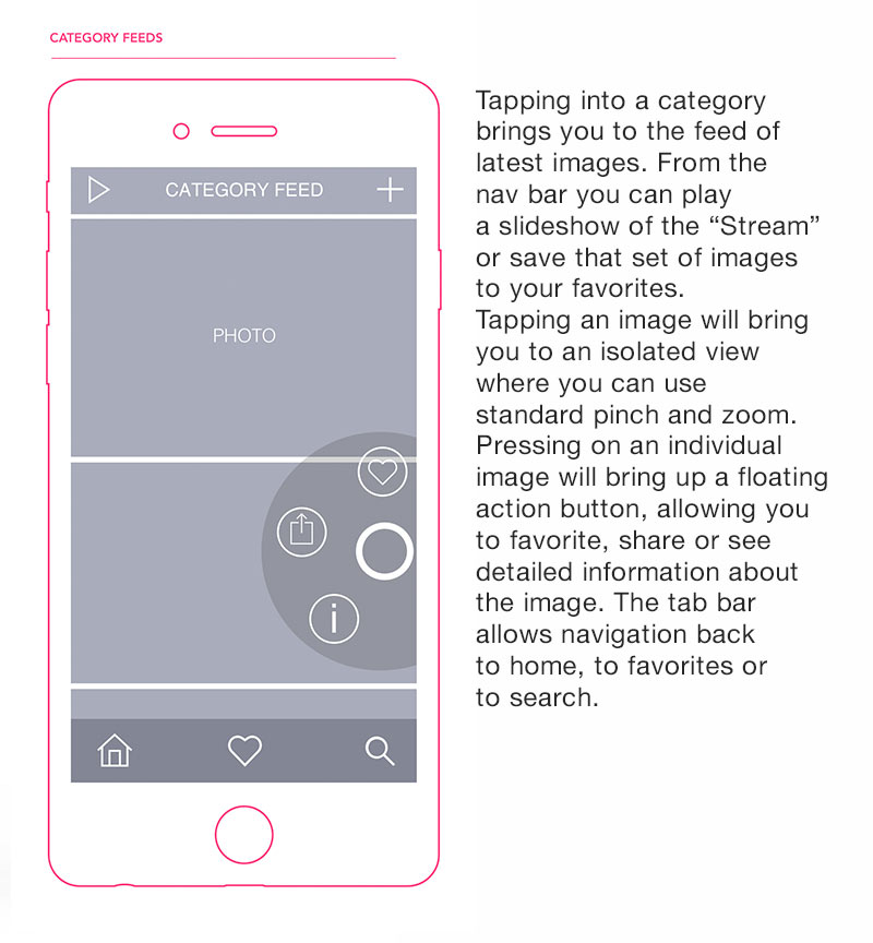
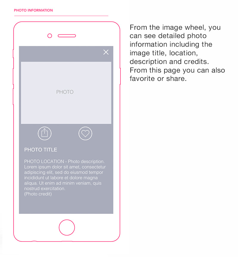
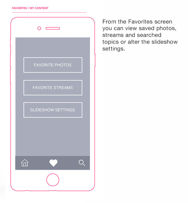
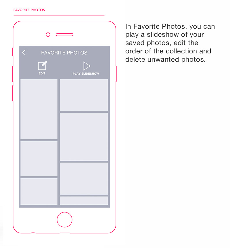
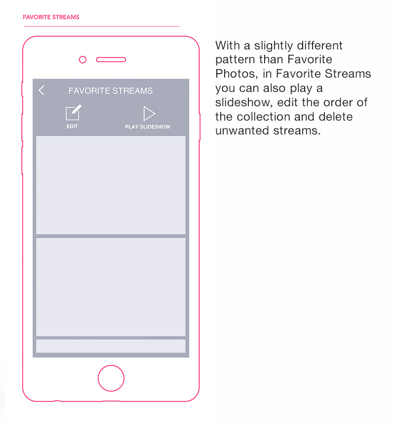
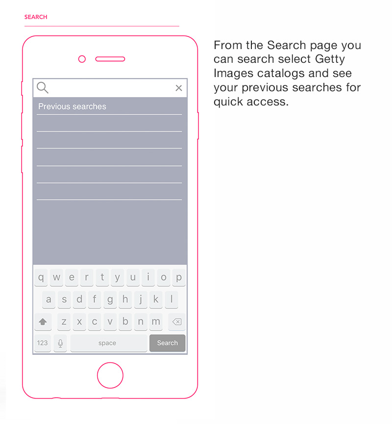
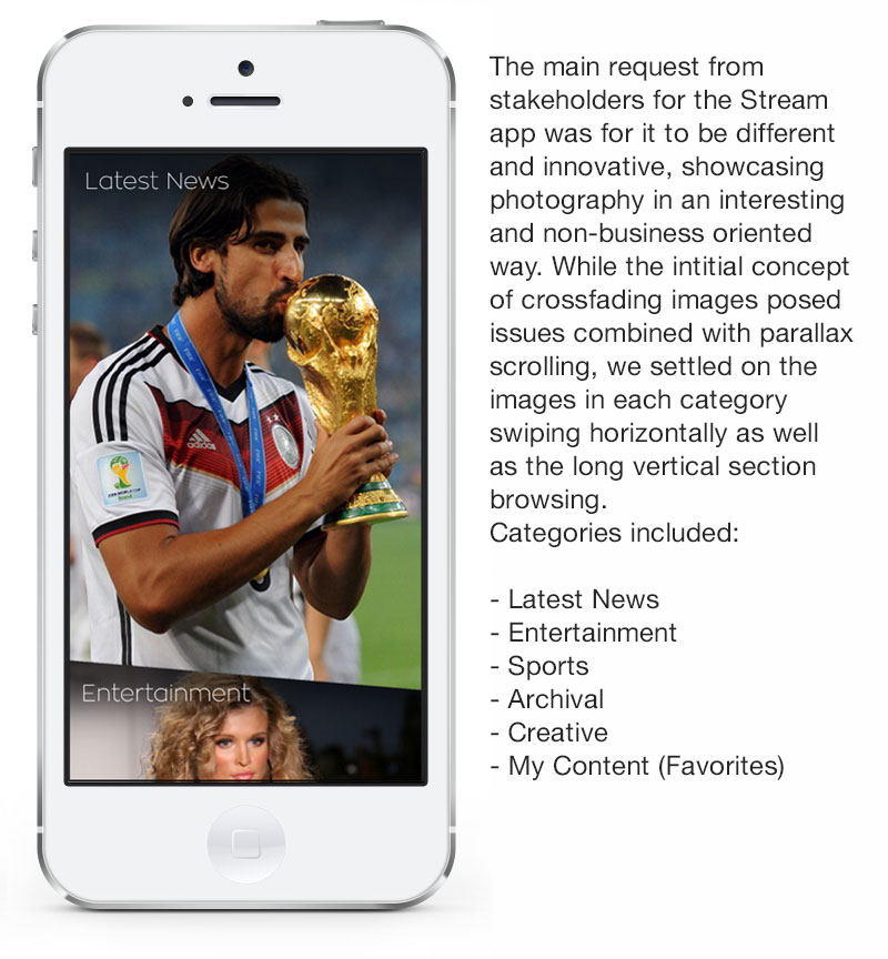
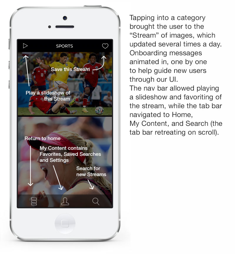
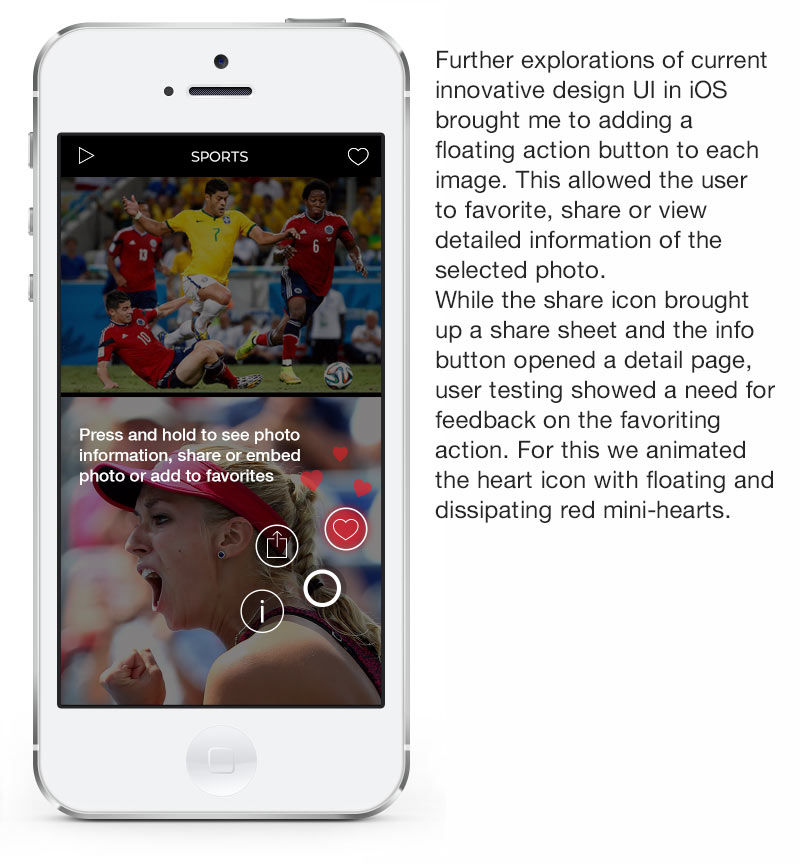
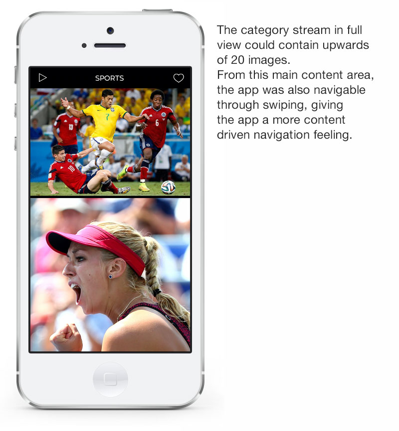
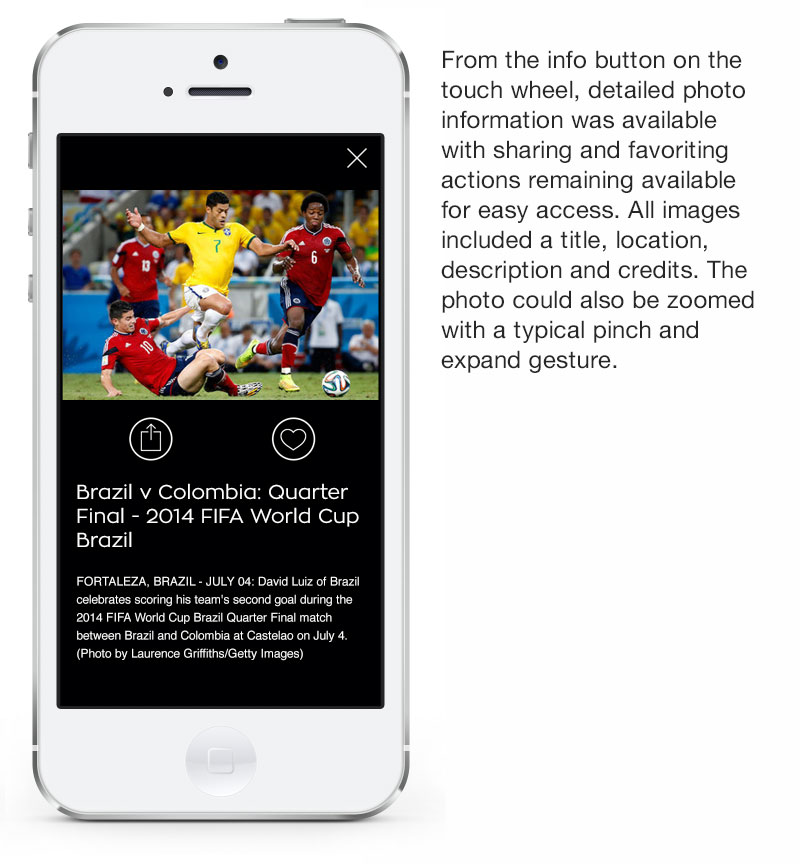
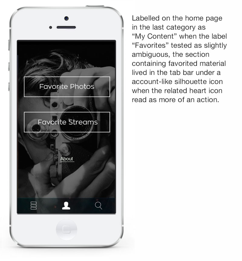
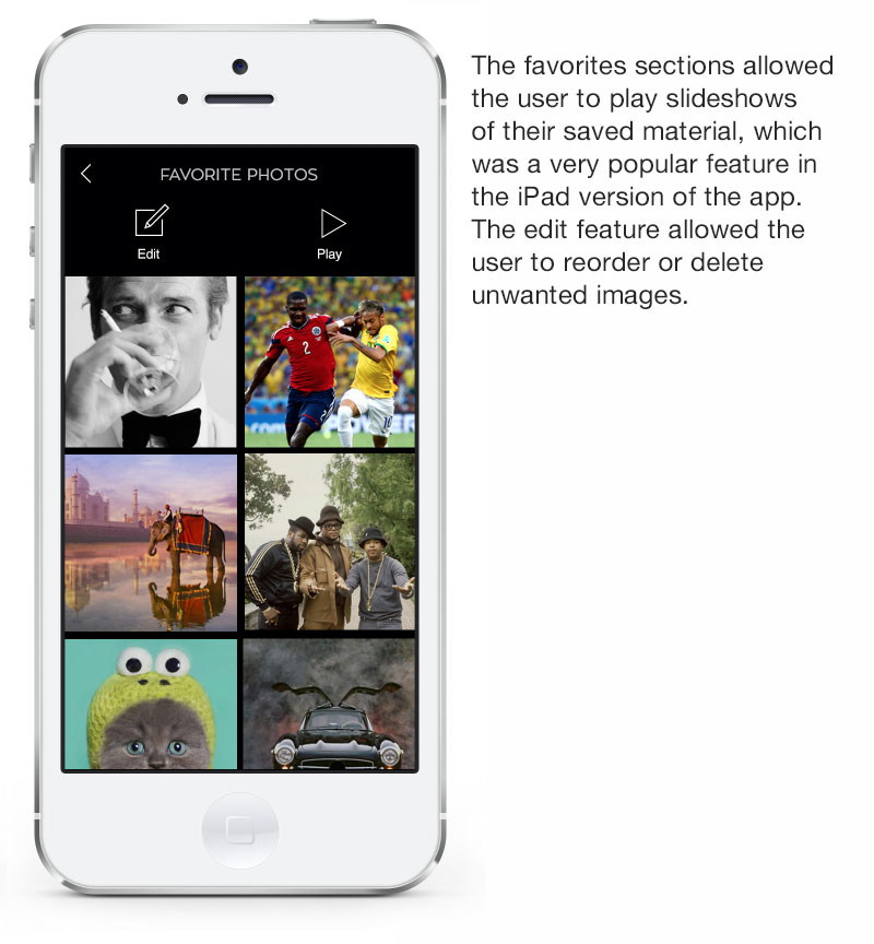
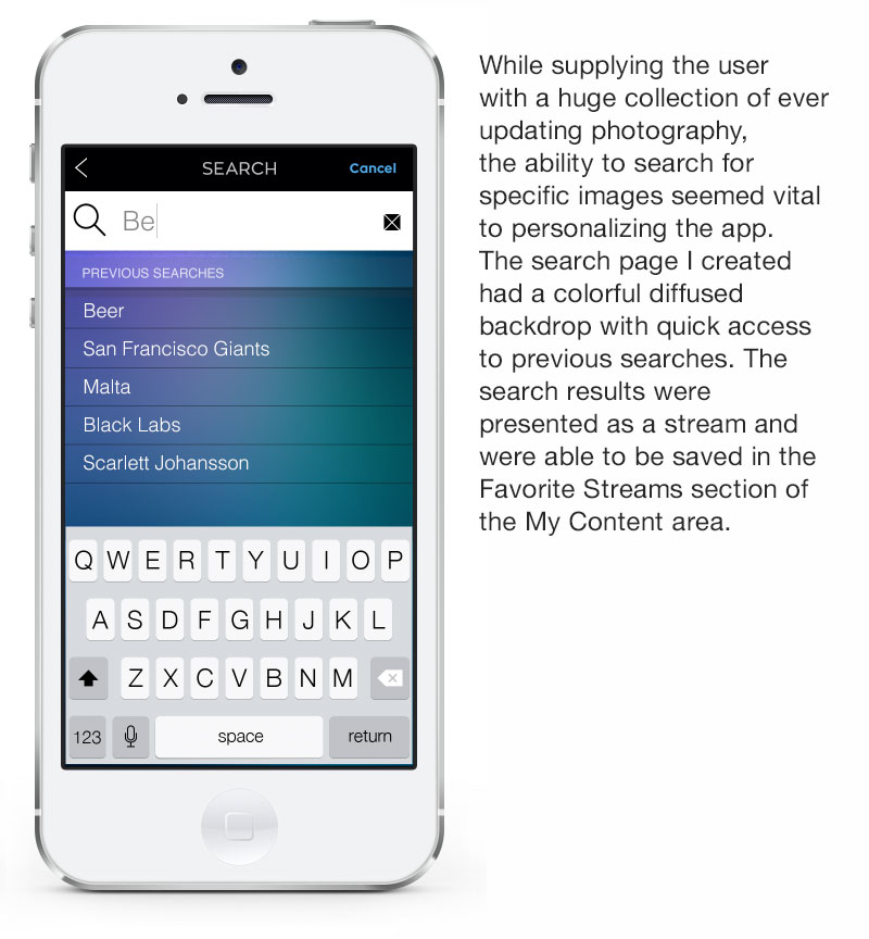
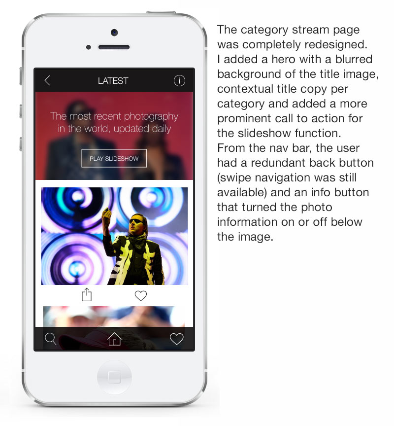
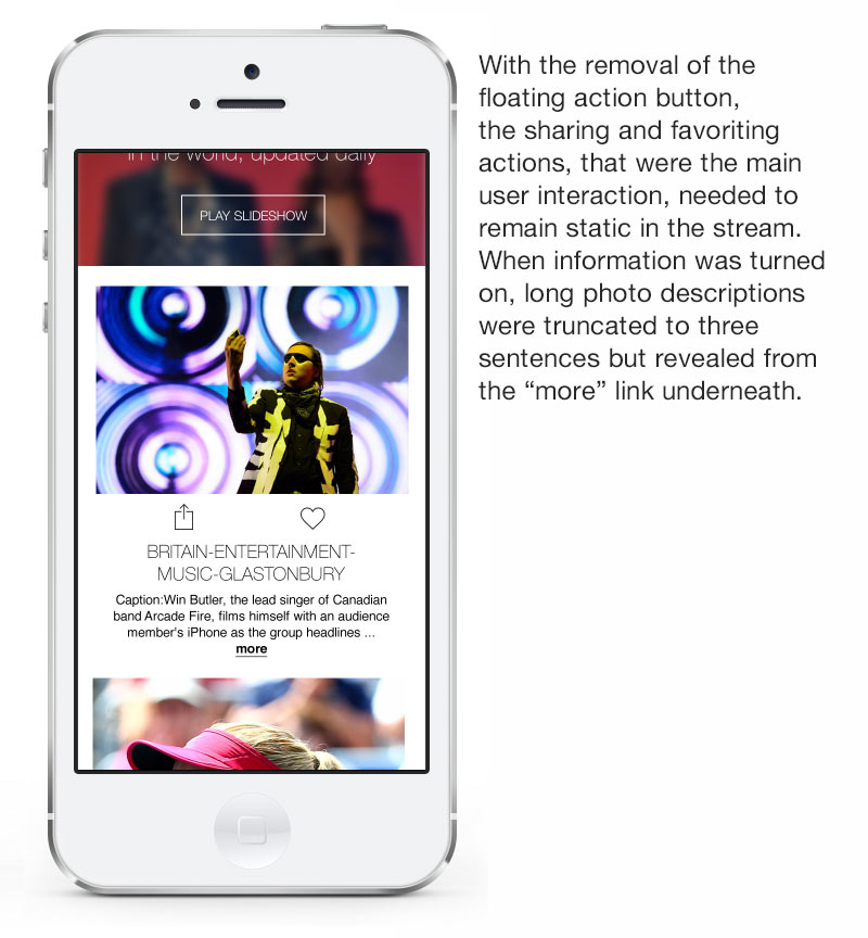
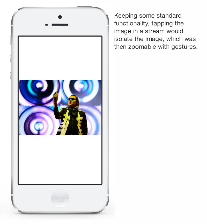
There was an inherent challenge in creating a simple yet innovative experience in a company whose main products are complex and functional. Having an unlimited amount of incredible visual material and a generous amount of autonomy in the project helped but there were still a lot of stakeholders involved that wanted to see immediate results and the pressure to create a product that would be evaluated not only by all of Getty’s executives but Apple’s as well was immense. My first step involved wireframing patterns while working on the site architecture. Paper and click-through prototypes helped balance the presentation of categories, collections and detail views with the actions of sharing and embedding that were required business goals. I was also able to incorporate my own ideas of value adds like the ability to play slideshows of saved material and to use Airplay to project and share with a larger audience. Working hand in hand with our lead developer, we were able to quickly build and test new ideas with Swift and test within our Agile team. As work progressed, the need to create a more unexpected experience became evident. We created a feeling of wonder with parallax scrolling and multi-directional swiping on the home page and used a floating action button for interactions with the individual photos.

Early Hierarchical Navigation site map
V1 wireframes
V1 screenshots
Featured release and exceeded download projections
On release, Stream was featured in the app store and returned to focus for nearly every update. In the first week we had 18k downloads and long dwell times recorded for usage. For every update we saw respective download surges and usage activity. Stream was a success and testing and several update releases followed.
Downloads data
Press for Stream


V2: Refinements and Restructuring
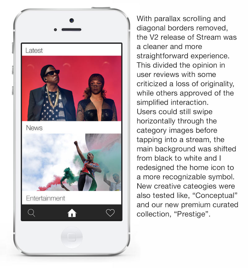
Despite our positive press, there were a host of usability issues that needed addressing. Our main issues involved the responsiveness in loading the constantly updating streams of images and working through some of the bugs related to working with Swift and Cloudkit for the first time. The novelty of the parallax effect and some of the original elements that stoked initial interest in Stream had seemingly worn off and I had a backlog of ideas that had been deprioritized. We conducted a series of usability studies as I worked to refine the app interface and then moved on to A/B testing of new work.
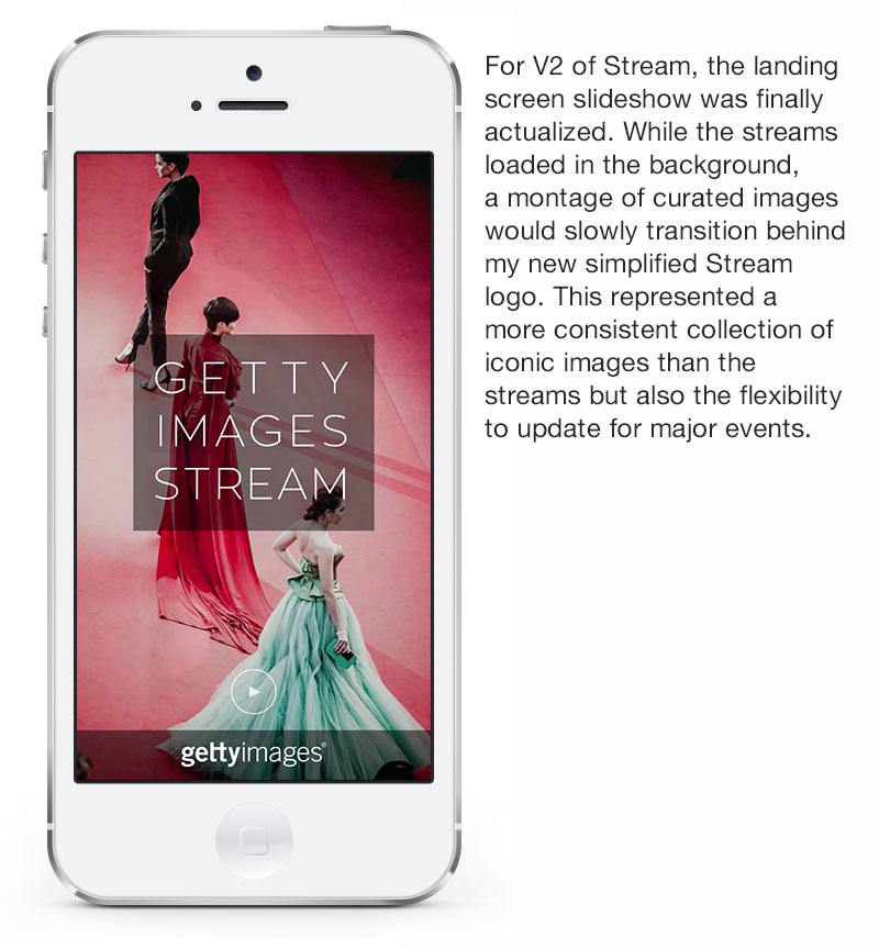
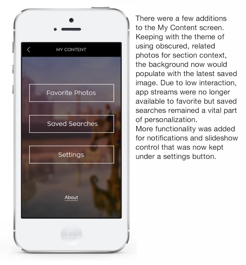
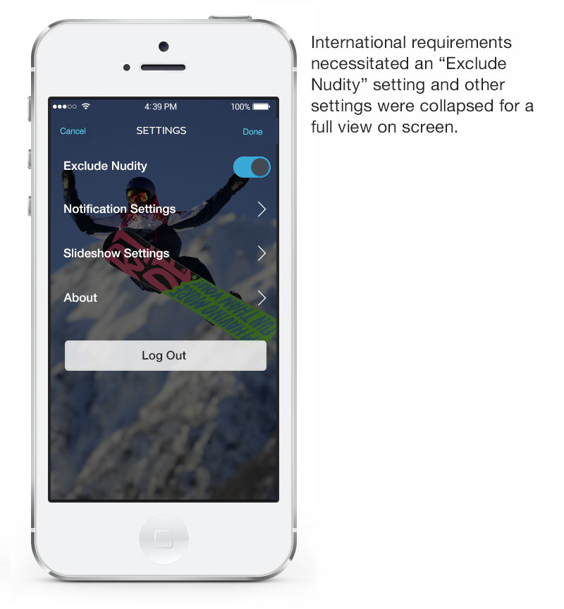
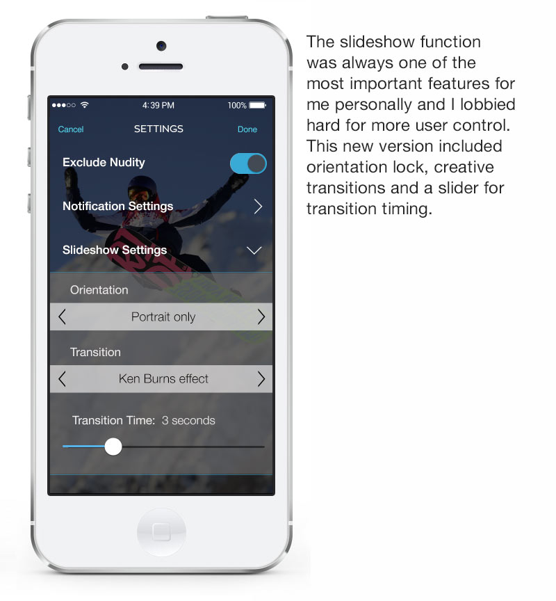
The new design resulted in a cleaner and more responsive experience. The initial loading screen showed a montage of our best images, creating a more consistent brand experience that we could update at slower intervals, the home page was a more elegant and easily navigated screen, and controls in the streams were standardized. The user control over notifications and slideshow options that I had felt was of high importance were finally added and the experience across iPhone and iPad was more consistent, clean and engaging.
There were several updates to V2 but company priority shifted and I moved to work on the core app and some new website features as a bridge between the mobile and web teams. After that, the opportunity for me to create the Apple TV app for Getty arose. Bolstering the idea of a free entertainment app that evangelized photo journalism and the art of photography while promoting the Getty Images brand, it became a logical extension of the work that I had done for Stream. The Apple TV app, like Stream being the first to use Swift, was one of the first apps using the new tvOS and was featured for over a year in the app store. In the continuum of these apps, my work was featured for over two years by Apple and reached thousands of people, bringing the world’s best photography into people’s lives for free.

Stream user testing and revised site map


BUSINESS GOALS:
Increase brand awareness
Increase interaction with non-business (everyone/unqualified) traffic
Maintain presence in contemporary tech platforms
Create systems for business and advertising expansion
My ROLE:
Product design, content strategy
UX Design: Information architecture, User testing, Site mapping, Prototyping
Interaction Design: Interface design, Format research, Visual design, asset management, Developer engagement