
A mindfulness app for kids: RESEARCHING A VALUABLE TOOL and setting design direction For a NEW TEAM
MY ROLE: UX Consulting (Team exercises to define users, empathy maps, service maps, persona exercises, best practices), UX design (Site maps, User flows, Research findings, Personas, Competitive analysis, Wireframes, Prototypes), Research (Field research, Surveys, User interviews, task analysis, analytics review), Product Design (Design systems, style guides, service mapping, brand management), Visual design (Color comps, new UI, walkthroughs)
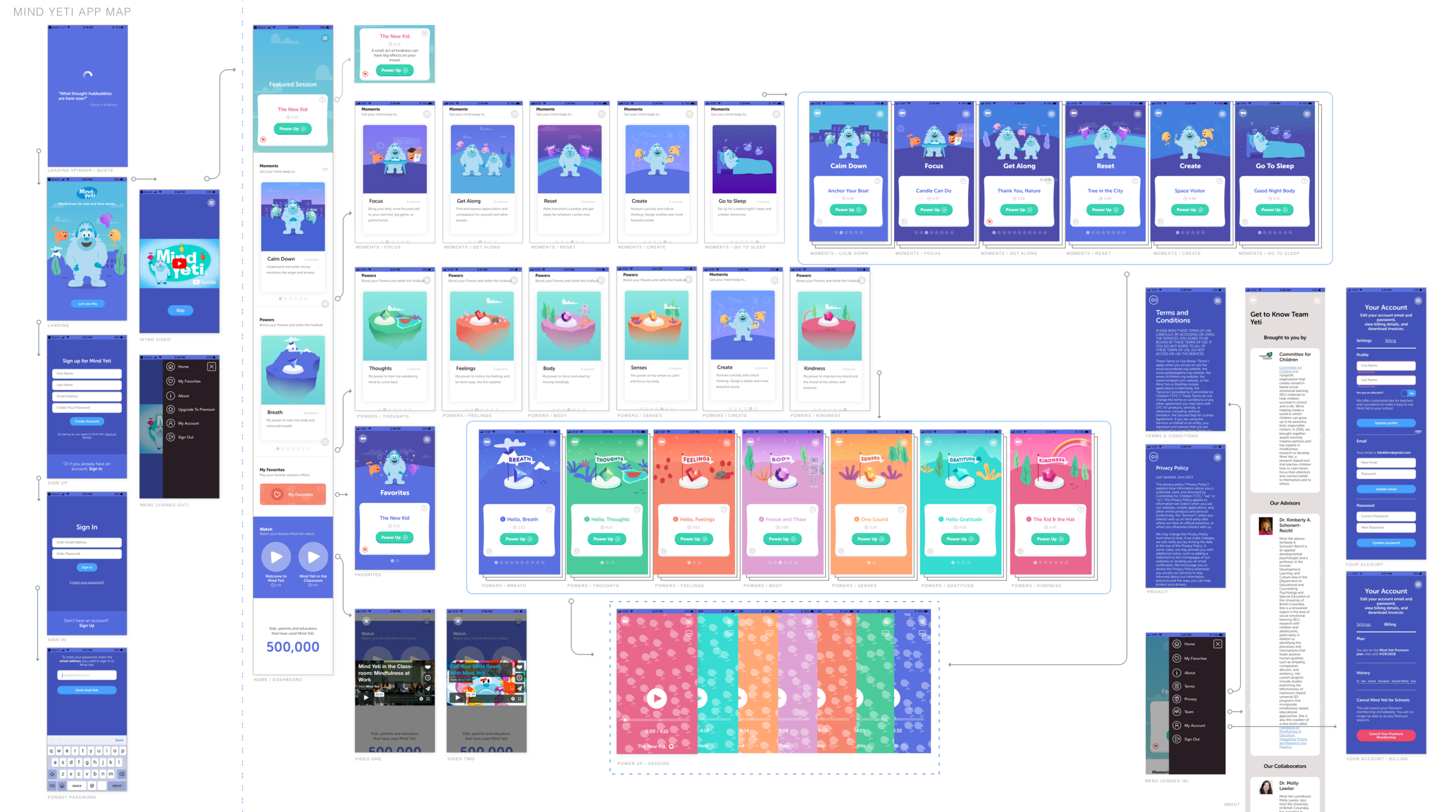
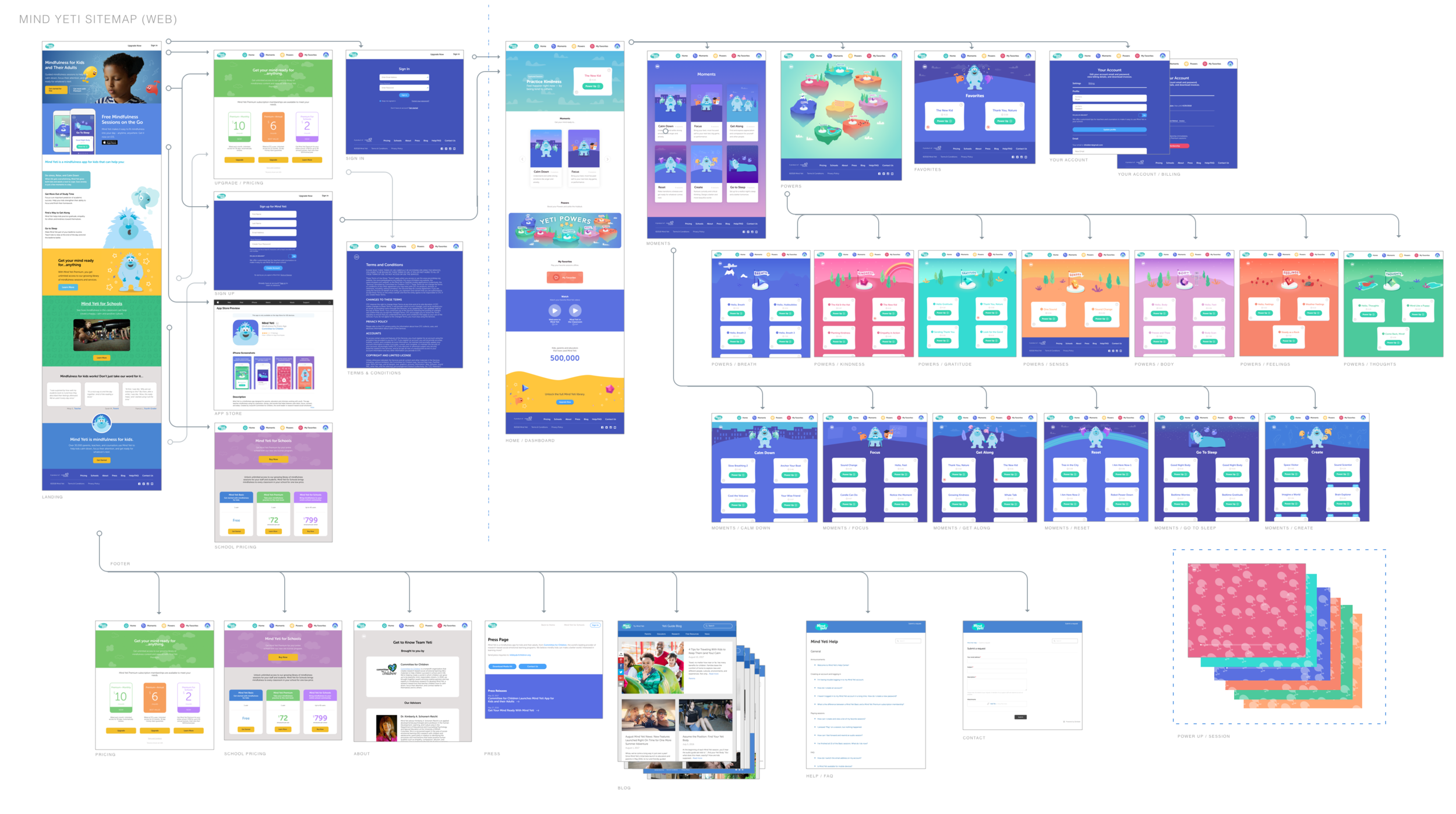
In 2018 I was invited to run a UX team exercise and check out the work being done by Committee for Children, a 40-year-old non profit in Seattle that develops educational programs to advance the safety and well being of children. An opportunity to work with such an altruistic company was impossible to turn down. Mind Yeti, a mindfulness app for elementary school children, had originally been created as an innovation project with the help of another well known meditation company, Headspace. Since its creation, Mind Yeti had gone through a full team turnover with the exception of the Product Manager/Content Expert and were ramping up to advance work on the app and create a multi-disciplinary team. I was first brought in to help establish UX guidelines and set standards for the new team. My initial approach involved exercises including empathy maps, archetypes, and a service blueprint in order to get an comprehensive view of the user journey and technical dependencies. After providing the team with interactive app and website maps in Invision (each screen in the map was linked to a corresponding full screen for notation), I accepted an invitation to stay on for 6 months to research and help build the team in preparation for their version 2.0.
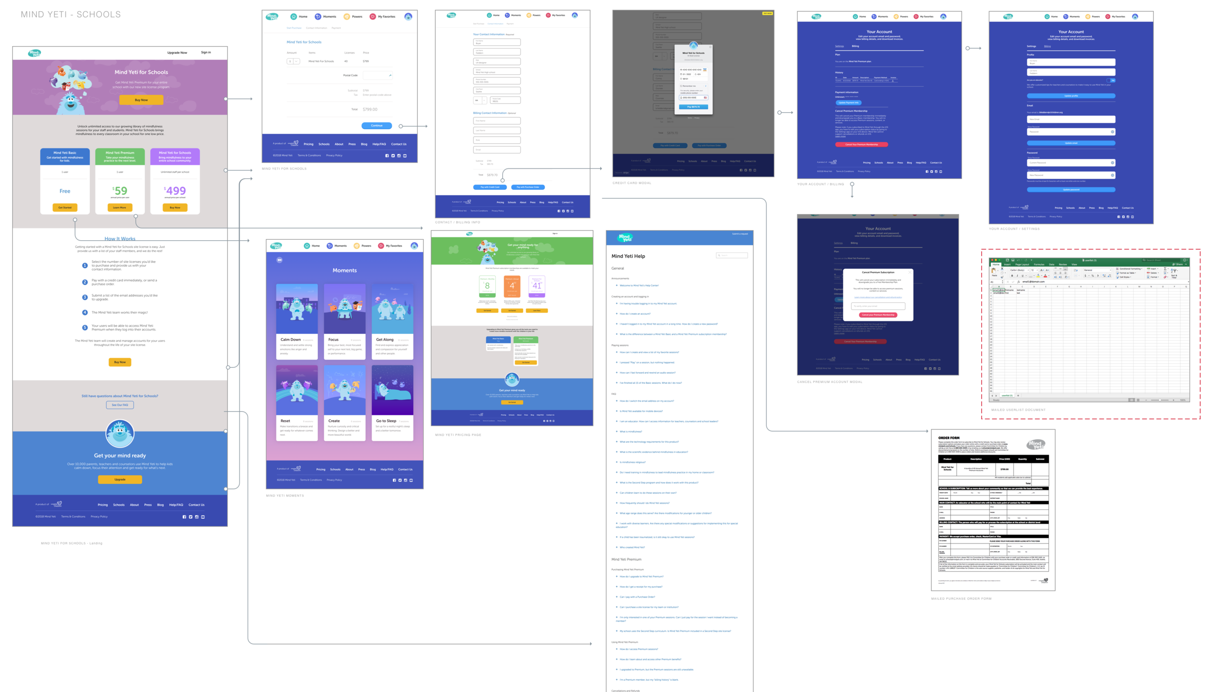
App and Sitemaps (preliminary mapping of existing app, website and web purchase path for schools)
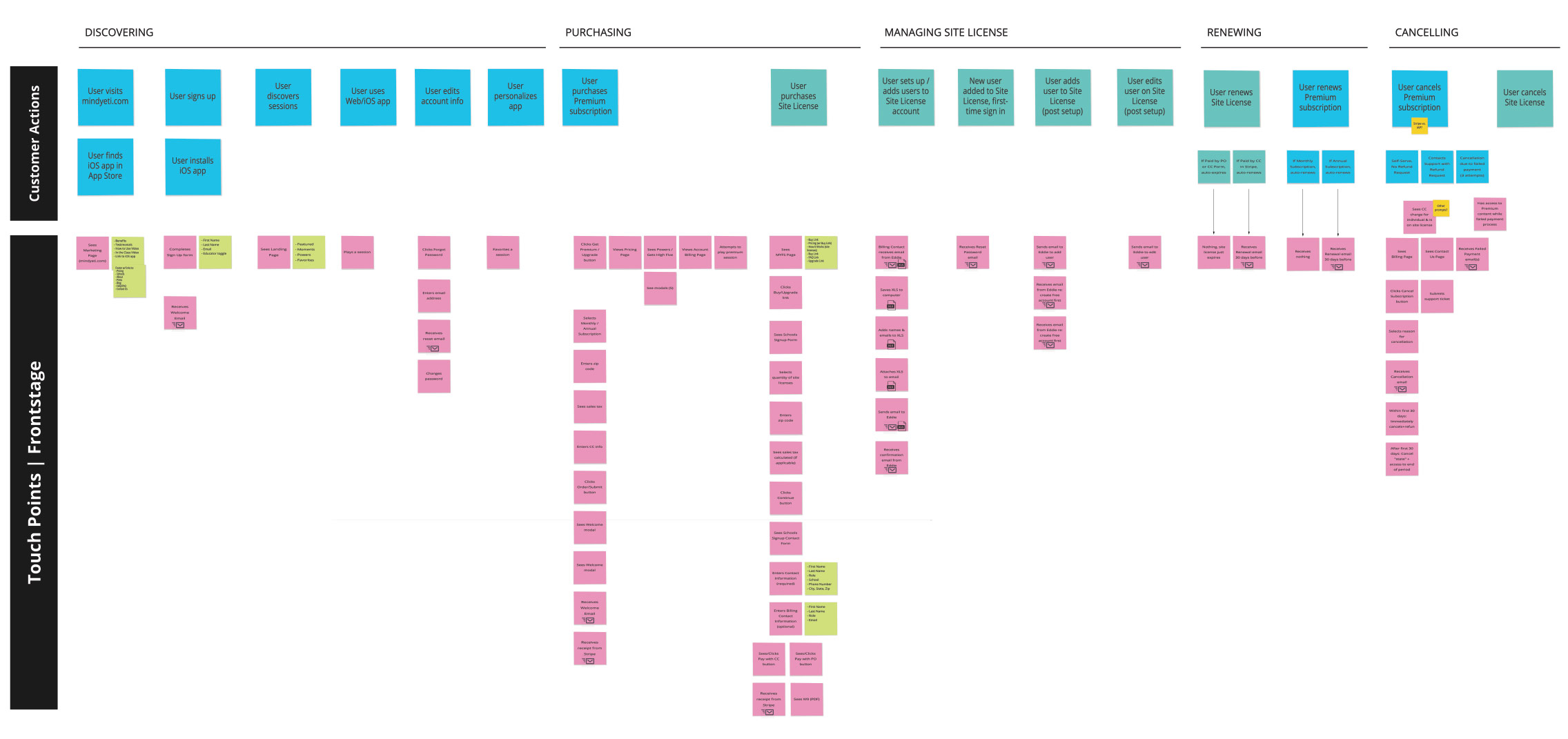
Service blueprint (team exercise)
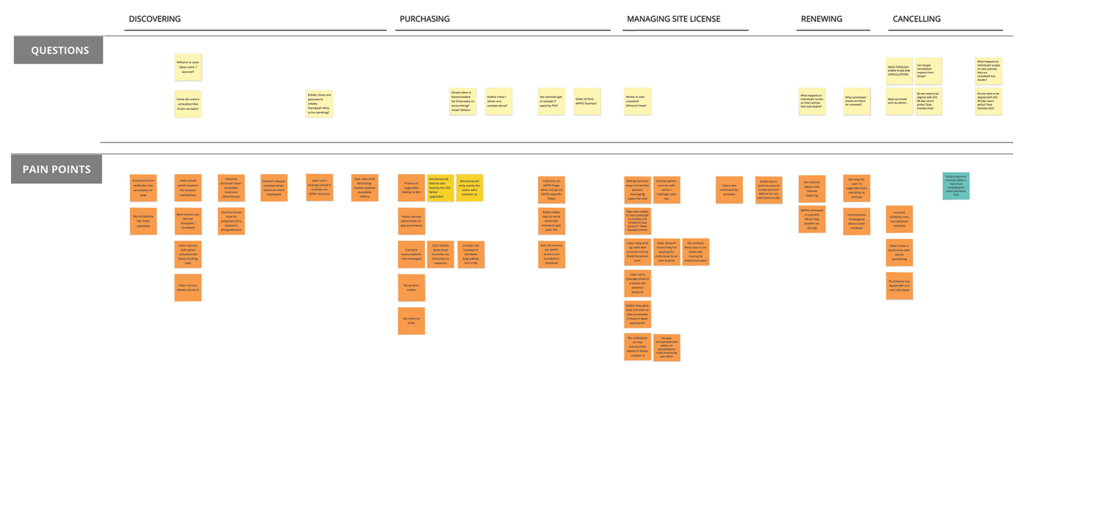
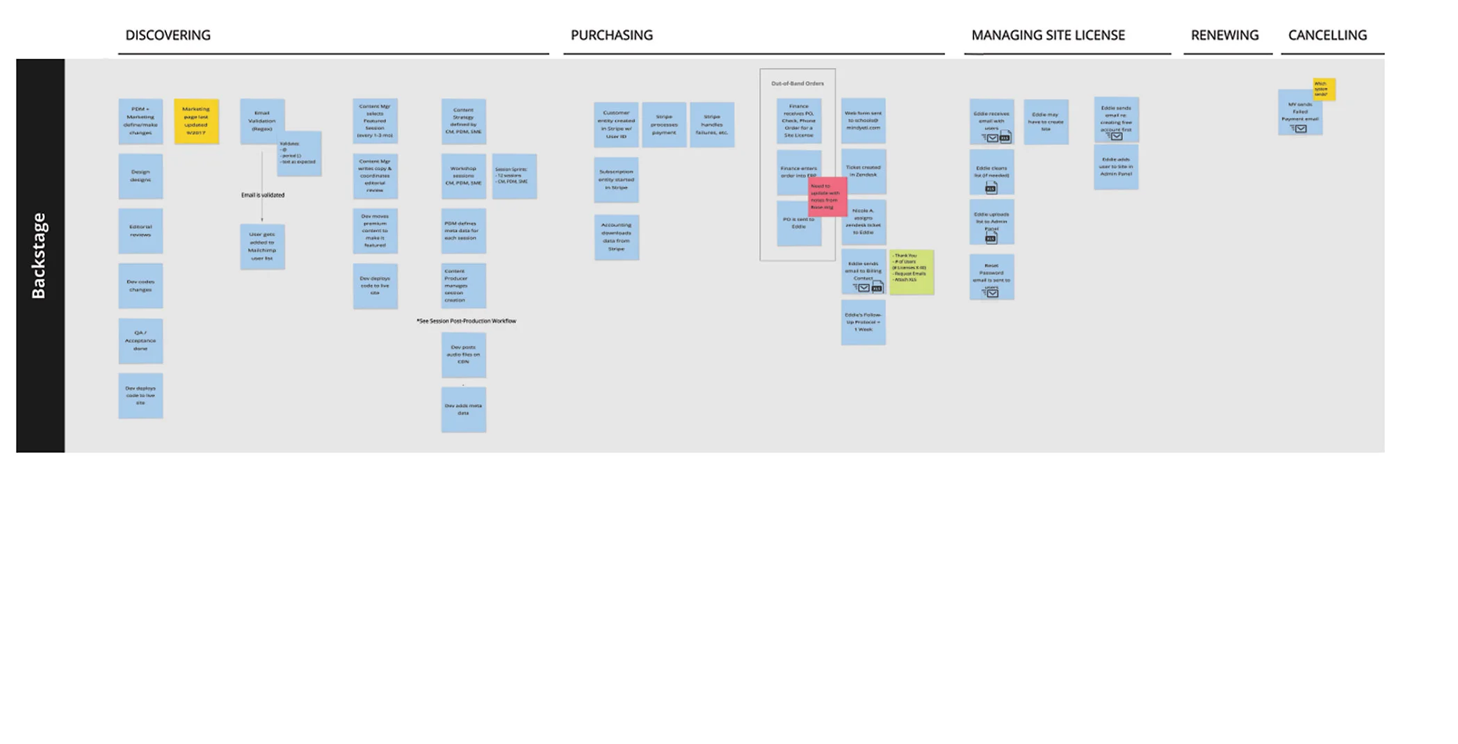
I thought it would be a good first step to analyze the current experience from a comprehensive point of view, creating an end to end document to visualize the relationships between front stage management and user journey with the backstage development and technical dependencies, including open questions and pain points. Being a mostly new team, this was a learning and bonding exercise that helped us become more familiar with our individual roles while in the same room. This helped the team to prioritize restructuring of antiquated methods, document less visible tech debt and show opportunities for automation of manual processes.
Service map insights:
Existing high level user journey
Technical Dependencies
User requests
Common obstacles/pain points
Opportunities for refinement, simplification, and automation
RESEARCH
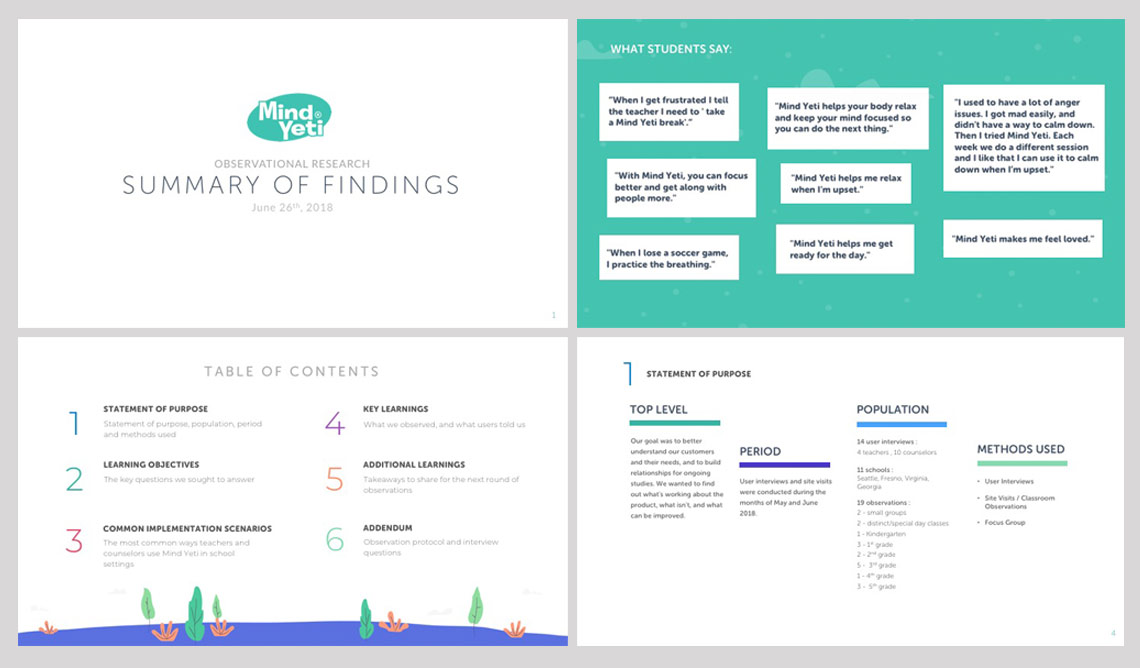
While beginning work on design systems and organization of existing design assets, the first full month with Mind Yeti was spent conducting field and usability studies with our Product and Project Managers. Starting in the Seattle area, we visited classrooms from 1st to 5th grade (including distinct classes with learning disabilities) to observe how the product was being used by counselors, teachers and students as well as to interview participants. Knowing that the Fresno School District in California was one of our largest adopters, we flew down to meet with several schools, a group of counselors and technical administrators from the district. Our goal was not only to understand how the product was being used and how it might be improved but to build relationships within the school districts in order to have ongoing studies into the effectiveness and satisfaction with the product as the design was updated and features added.
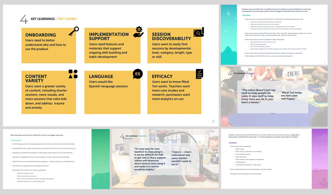
At the end of our research we had conducted field research at 11 schools and 19 classrooms, including 14 user interviews, a focus group of 15 counselors and a private session with technical administrators from the Fresno school district. The insights gained were fascinating and the appreciation from students and teachers alike was heartwarming. The students were gaining a lot of self control and social coping skills from the mindfulness sessions and one little boy even said that Mind Yeti made him feel loved. From our research we determined:
Districts wanted ways to track usage and effectiveness, wanted to expand services (preload devices, expand to other schools), wanted to find ways to share Mind Yeti with students’ families and needed a Spanish language version.
Teachers were focused on a better onboarding experience or access to guidance while using the app, wanted more diverse content, needed to have more session suggestions and to be able to find sessions easier based on various criteria.
Students wanted more visuals, more instructions on breathing, more sessions with movement and more imagination provoking or game-like interactions with the Mind Yeti characters.
Report of Findings from month-long field and user studies

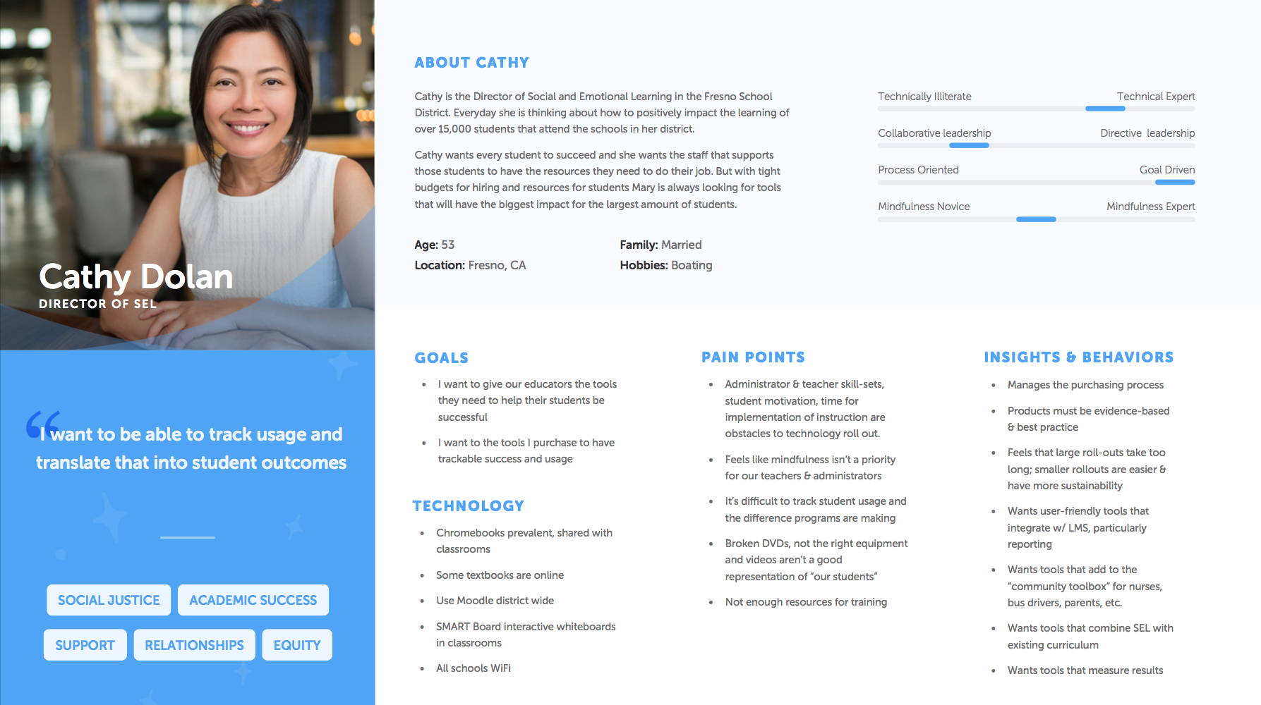
Provisional Personas
From our insights gathered through field research, interviews and surveys, I worked with the agency we had on hand to create some provisional personas. This helped to keep both our team and entire company clear about our various users needs and objectives while we grew our team and started work on Version 2.


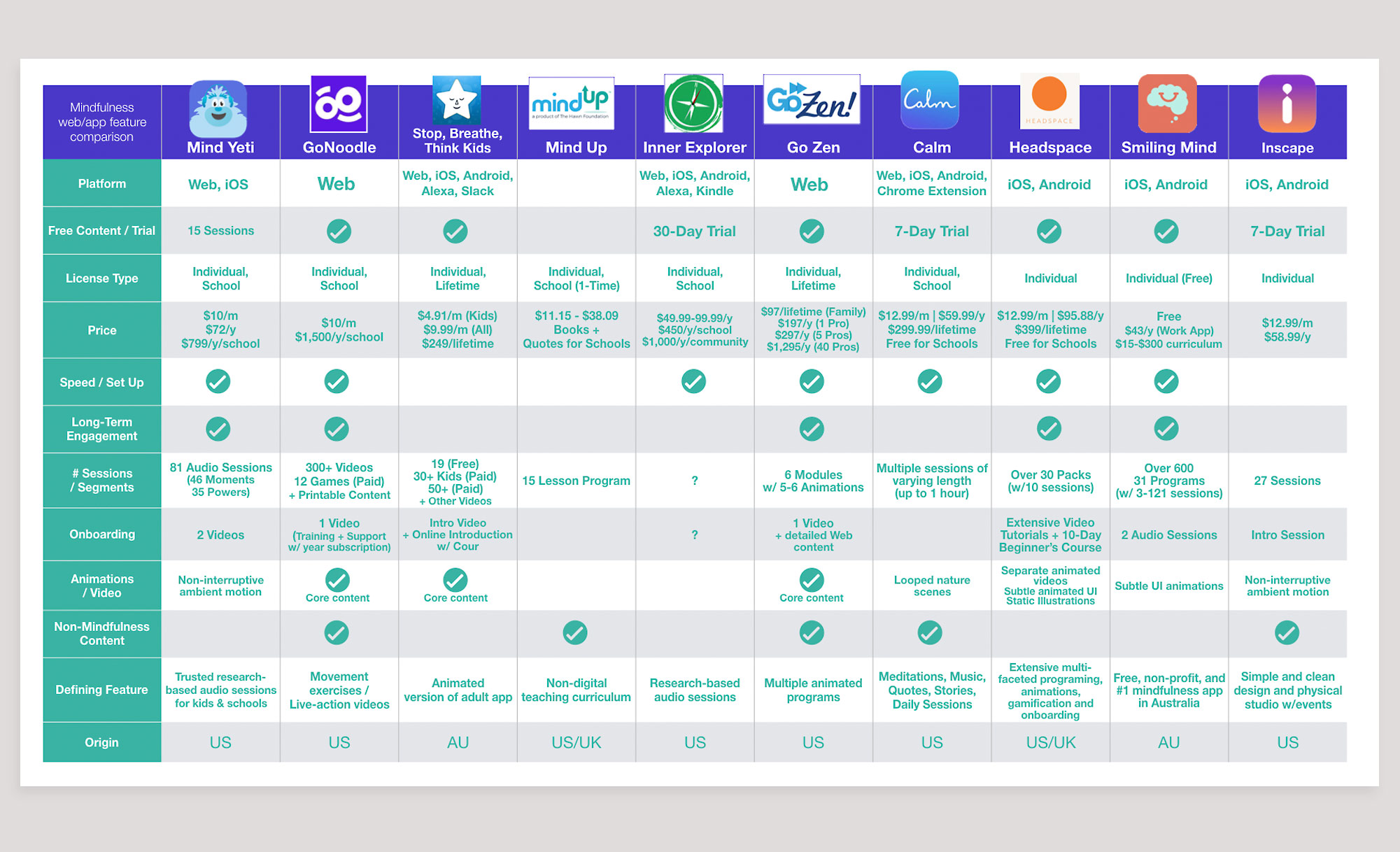
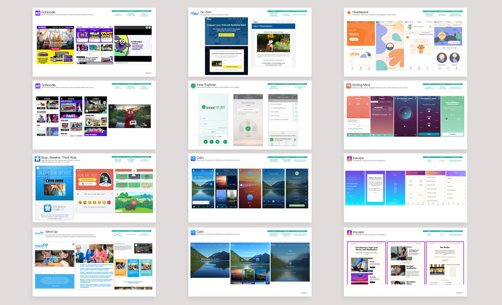
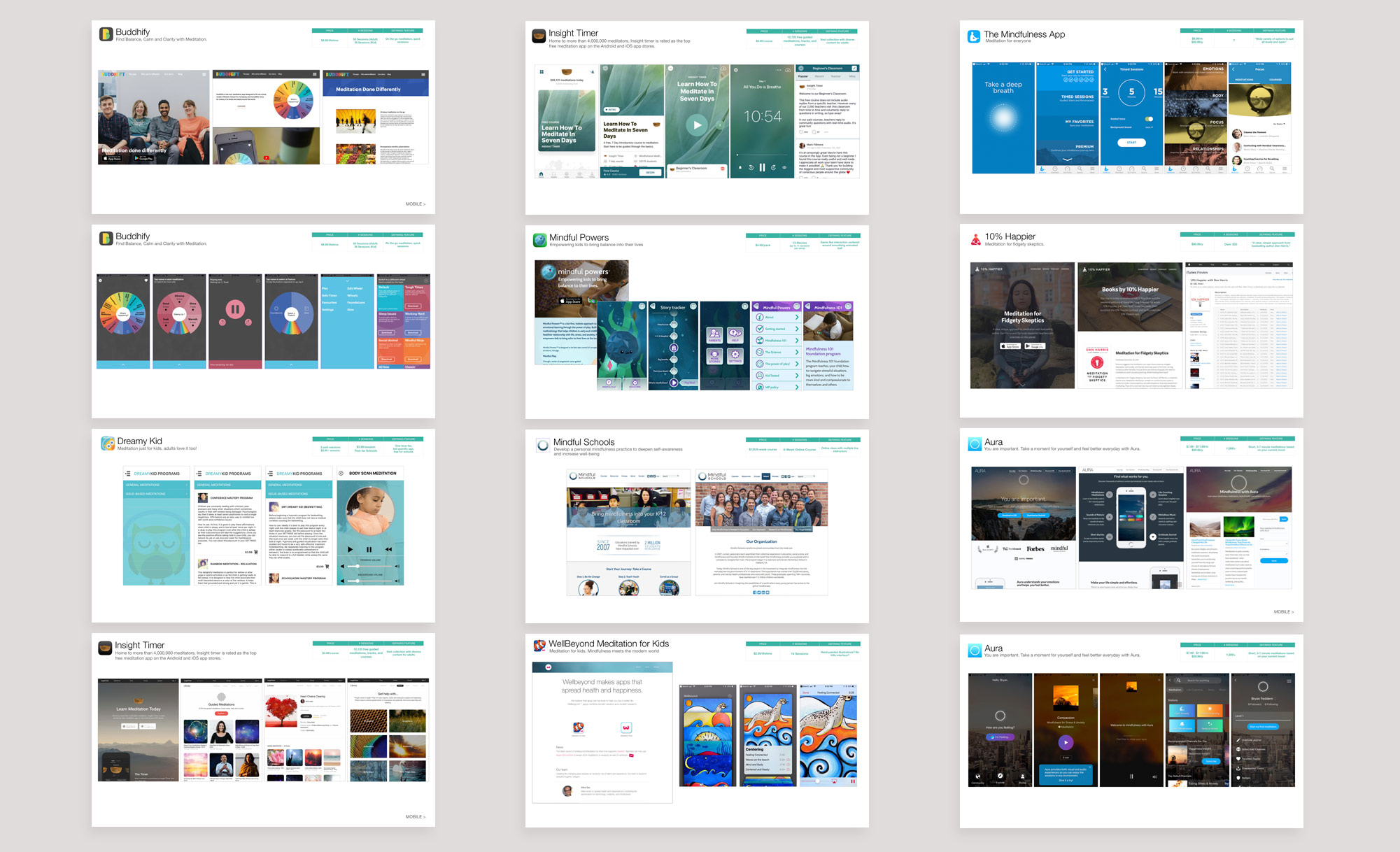
Competitive analysis (study of 18 competitors, features and pricing)
The market for mindfulness is in a time of rapid growth and the array of different experiences and services is vast. The biggest commercial players are Calm and Headspace but their appeal to the general public doesn’t necessarily translate for schools and classroom settings. There are, however, many other mindfulness programs catered specifically to kids and are intertwined with learning programs and services. This document compared 18 competitors on:
Platform
Pricing
Onboarding
Nature of content
Volume of content
Additional content
Market

School pricing/licensing
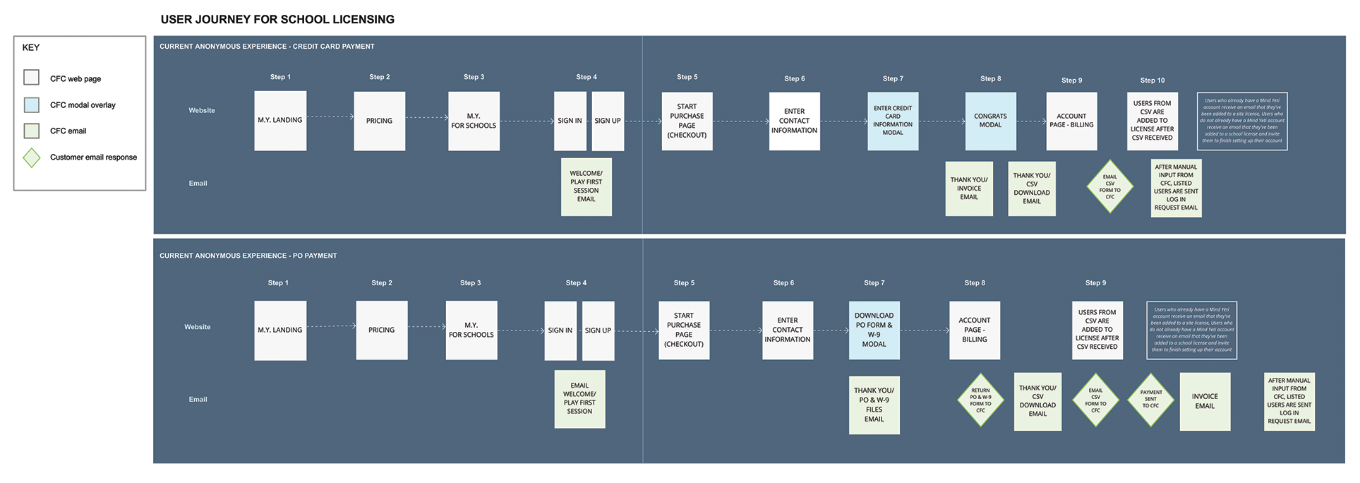
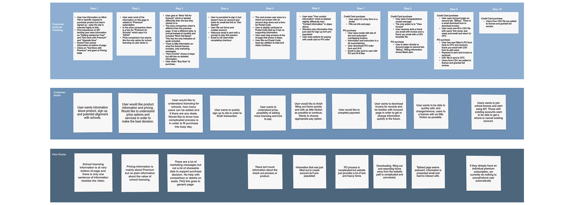
The first step as we approached the new school year was to examine and update the user journey for school licensing in order to aid in the push for greater adoption from school administration. The existing process had an antiquated interface design and relied on personal emails and manual input of data. I first outlined the user journey (below) calling out user process, goals and pain points. I created a complete user journey for the current CC and PO purchase experience.
Journey map for existing school licensing with analysis for redesign
User Journey for School licensing using Credit Card and Purchase Order
Customer Actions/Thinking
Customer Goals
Pain Points
SCHOOLS Purchase path REDESIGN


The next step was creating wireframes and flows of the user journey. The ingress from the marketing page was the first step and the existing design looked nearly identical to the public pricing page and centered around a 5-step instructional graphic. I created a new hero graphic with a value prop rewritten from research data, added a license calculator that informed purchasers about user and school effects on licensing, included compelling testimonials from our recent school interviews, added the school documentary video to the page to exemplify the product effectiveness and added a link to FAQ’s commonly requested from schools.
The purchase path forms that spanned multiple pages were consolidated, labels were moved outside form elements and steps were cut down from 5 to 3. This included designing a feature for granting user permissions that used to be handled by emailing an Excel spreadsheet back and forth. A pre-populated school list based on the user’s address was added as well an online process of either cut and paste email address addition of users information or an upload of CSV file. This page would also serve as the admin page from the purchaser’s account. The final design was for the Account page which previously had been unlabeled in the main nav and had a strange and disjointed experience.
School licensing Marketing page visual design & previous version
A new, bolder hero graphic with a value prop rewritten from research data.
A license calculator that informed purchasers about user and school effects on licensing was created.
Compelling testimonials from our recent school interviews were included to help purchasers get buy in.
The school documentary video was added to the page to exemplify the product effectiveness.
A link to FAQ’s commonly requested from schools was put at the base of the page in case of any lingering questions or need for data.
Restructuring the core experience
Original home page
Using our research findings as a guide I set out to design a more dynamic experience that worked to solve key issues from teachers and students. Most importantly, teachers needed an easier way to access and change sessions so that they could have fresh content when they wanted it and could dial in the right content for specific situations. Students normally interacted with Mind Yeti in the mornings, after recess or lunch, before tests or creative exercises or when there was trauma. Finding the right sessions for these instances required more than simple categorization. Our content expert started a process of creating playlists that could be used to guide the user through different levels of experience and alternate settings with sessions. There were several aspects that were prioritized for later sprints including Spanish language and CC controls in the new player, build out of non-session pages and expansion for web page designs. These final app designs include:
Immediate ability to play sessions
Main session interaction through curated playlists to give long term guidance
Favoriting of playlists and sessions as well as the ability to create custom playlists
Design based on reach navigation, placing main controls within thumb reach
Pattern affordance for category types
Core experience isolated to session interaction and personalization
Inclusion of Tips & Help in menu
Expansion of choices for sessions visuals
My ROLE:
UX Consulting (Team exercises to define users, empathy maps, service maps, persona exercises, best practices)
UX design (Site maps, User flows, Research findings, Personas, Competitive analysis, Wireframes, Prototypes)
Research (Field research, Surveys, User interviews, task analysis, analytics review)
Product Design (Design systems, style guides, service mapping, brand management)
Visual design (Color comps, new UI, walkthroughs)
BUSINESS GOALS:
Build cross functional team
Secure design assets and create design systems
Design version 2.0
Improve purchase path for school admins
Increase adoption in school districts
Increase individual subscription and usage
Increase reach of help and assistance for elementary school age children