Getty Images Apple TV App: Designing for a new user experience
MY ROLE: Product design, UX Design (information architecture, competitive analysis, user research, site mapping, prototyping), Interactive Design (interface design, format research, visual design, styleguide and asset management, developer engagement)
Remaining in the Apple TV app store as a “Best New App” and in the “Apps We Love” categories for over a year, the Getty Images TV app was a fascinating effort to allow new audiences to explore poignant photo journalism and world class creative photography on their home televisions as well as save and create slideshows of their favorite images. I led the product vision and design while working closely with developers and research. I seized the opportunity to strengthen our ongoing relationship with Apple, expand our brand awareness, create opportunities for continuity in our mobile experience, provide a new opportunity to research our users and to establish a new platform for feature presentations.
After working on websites and mobile applications for most of my career, the chance to shape a product with a “10 foot experience” that could be used by more than one person at a time in more relaxed space posed an exciting new opportunity for gaining user insights. The lead developers in my cross-functional team were given early access to Apple’s tvOS and started work on a game concept for the Apple TV during a hackathon and I was invited to join in the effort. The initial concept was a quiz game called “Feud” that leveraged Getty Image’s vast photo library to allow multiple users to answer questions on their phone about an un-labeled photo. Although we did not win the hackathon, the ability to create quickly on this platform garnered some attention from executives.
Seeing an opportunity for widening our consumer (entertainment) offering and to create a framework for continuity and personalization in our suite of apps, I began design concepts as the developers started working on a POC. Working with our Mobile Product Director I created presentations highlighting our opportunity, with an ongoing partnership with Apple, to be first to market in the new TV app store, increase customer engagement in both B2E (business to everyone) and B2B spaces as well as being able to use data to determine which areas of focus around B2E customers engage with in efforts to target future advertising in an efficient way. Through these efforts we were greenlit to pursue our first release.
A.) Players use a companion iPhone app to answer questions B.) Game play is timed and asks a question about an unlabeled photo C.) Answers and winners are revealed before moving on
FROM POC TO V1 RELEASE
The initial proof of concept build was based on the structure of our Stream app (and its content ingress), relying on consumer interest in our editorial image offerings of current events in news, sports and entertainment, as well as our vast library of archival photography. The structure (shown below) was a simple architecture of category > subject/event > gallery > detail. This provided a basis for user intent but lacked a platform for wider curation or more passive discovery.
POC homescreen and sitemap
When I started to expand the experience of our TV app I knew that the intended behavior for TV viewing and Connected TV app engagement was very different from our existing apps and web experiences. I wanted to make sure that there was an impactful passive viewing experience that required less engagement with the new and slightly problematic remote and to allow as much personalization as possible in an easily digested experience for multiple users. In order to work quickly and see interactions on our large office TV monitors, I worked with block prototypes in Keynote, which allowed me to add simple transitions and alter the architecture incredibly fast. With the Keynote walkthroughs, I was able to collaborate and get feedback from dev, product and research in turn allowing our developers to create a V1 build that we were able to put up for internal tests. The insights that I gained from user tests and competitive analysis prompted these additions:
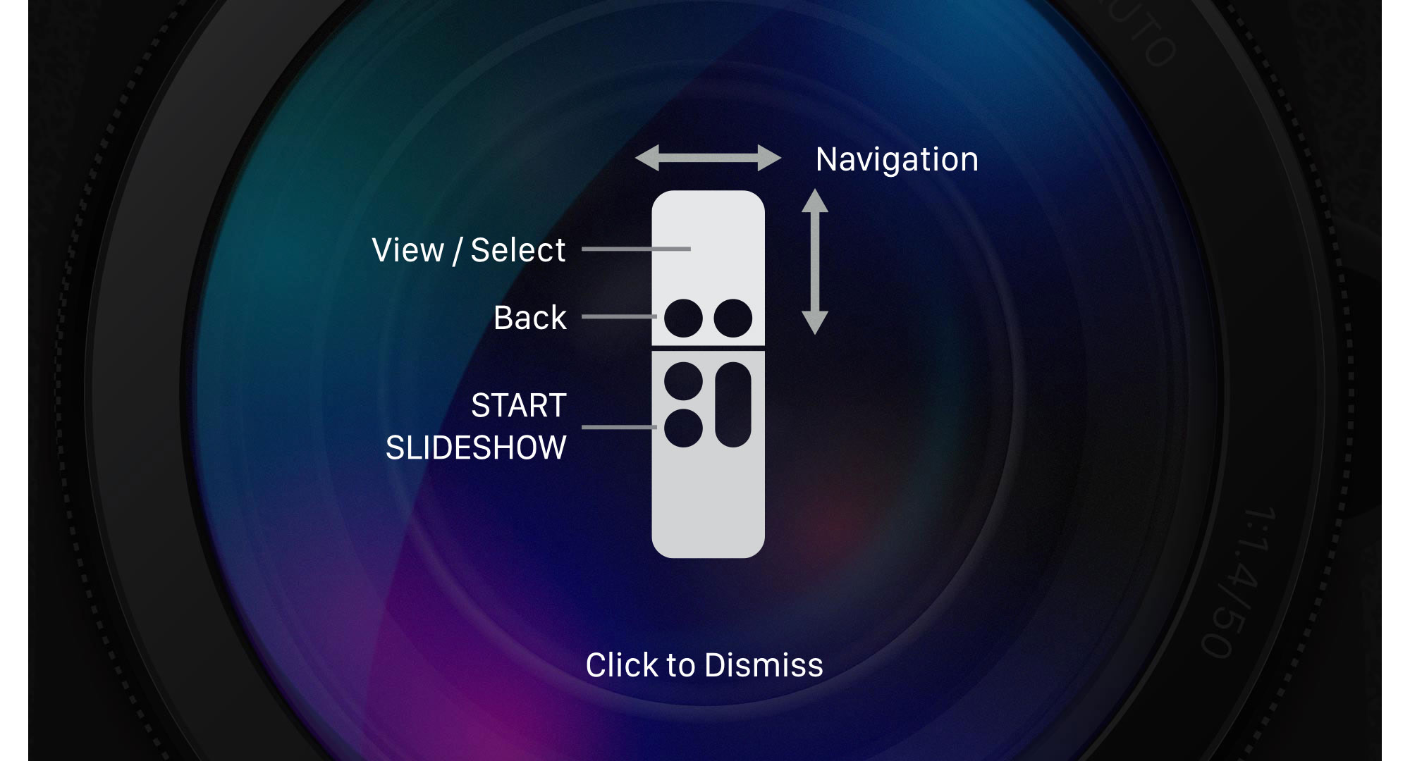
An introductory explanation of remote functions with an easy way to return to these instructions
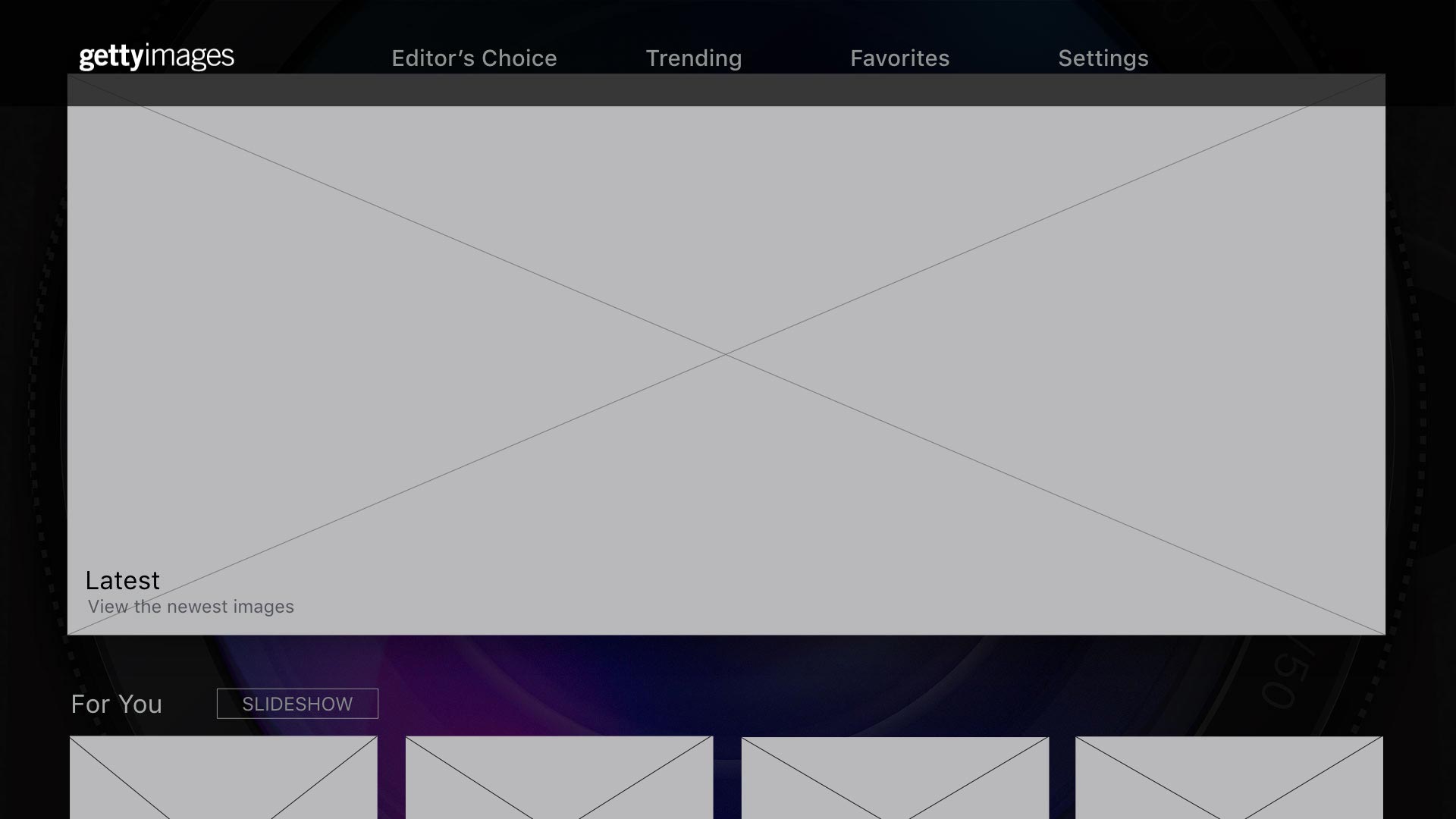
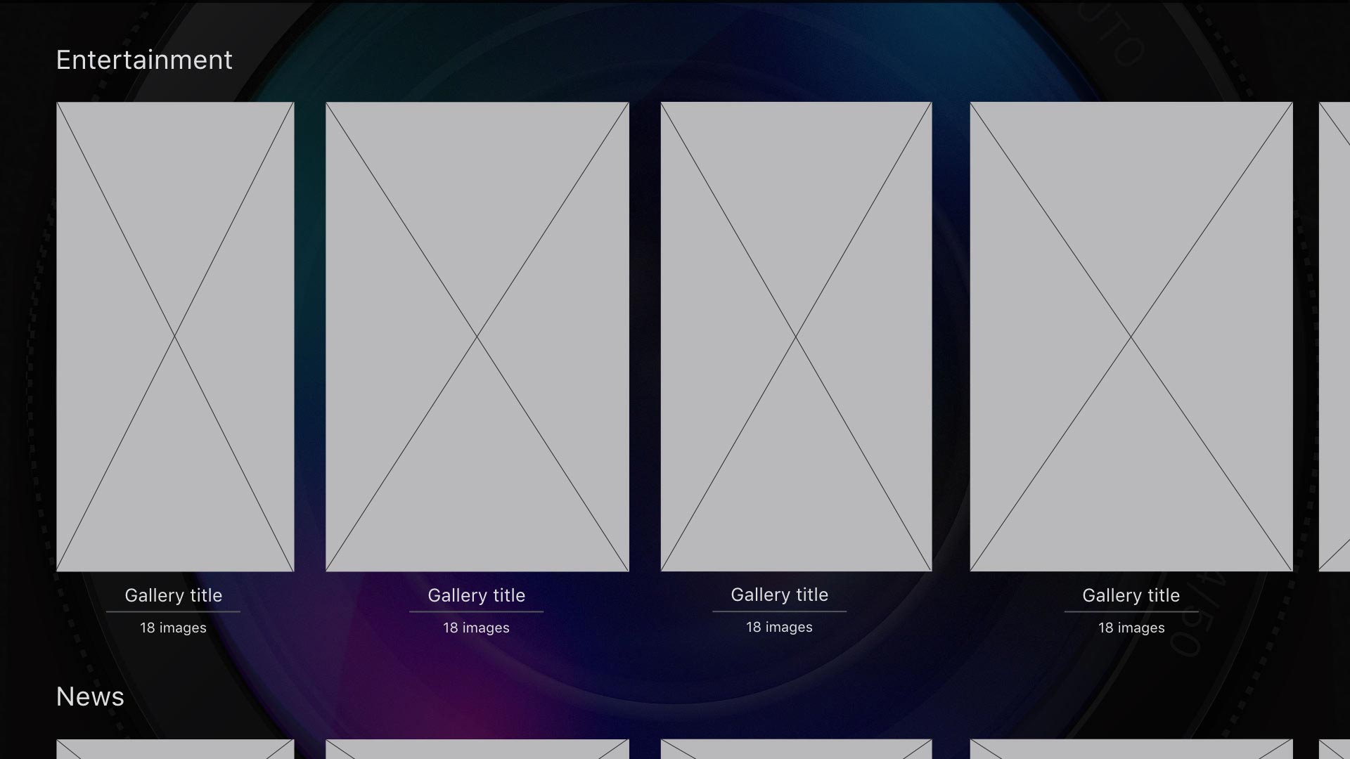
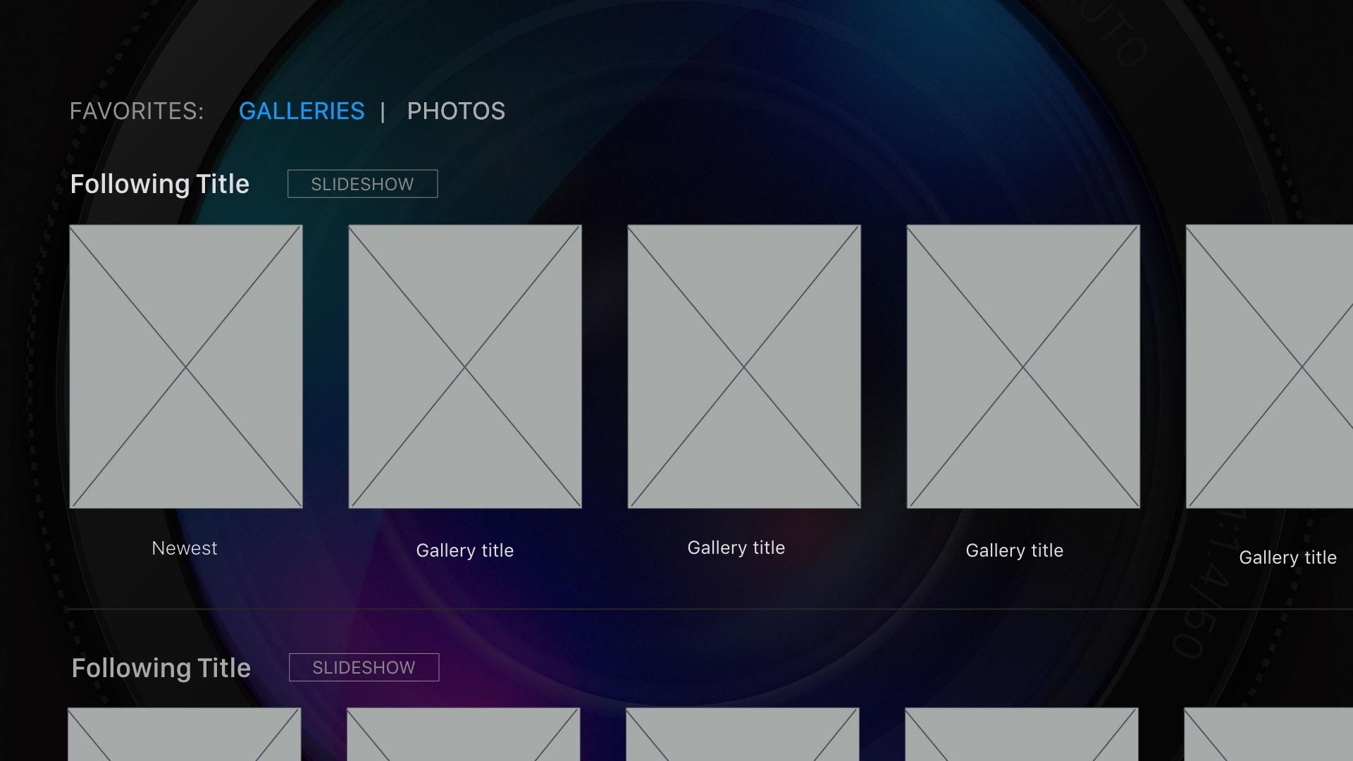
A large crossfaded slideshow of curated images on the home screen, allowing enjoyment of content without further engagement
Curated galleries below the hero slideshow on the home page, giving the viewer a large choice of content without having to engage with navigation
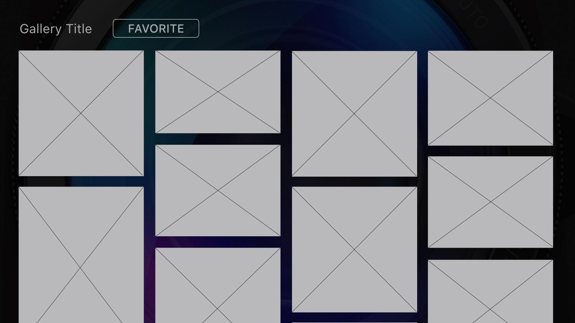
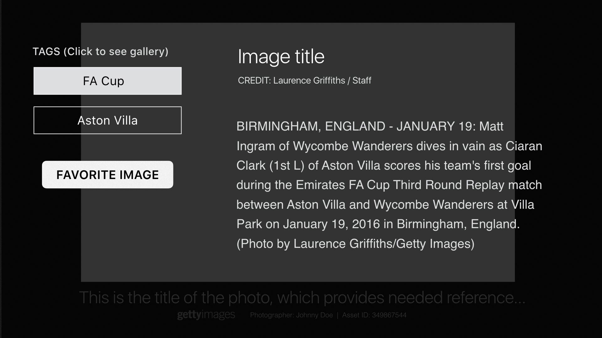
Engagement with photos provide isolated view first and further information upon interaction to utilize available space and reduce frustration with primary goals
Trending events as a first segment of the main navigation. Giving the most timely and sought after content it’s own dedicated section
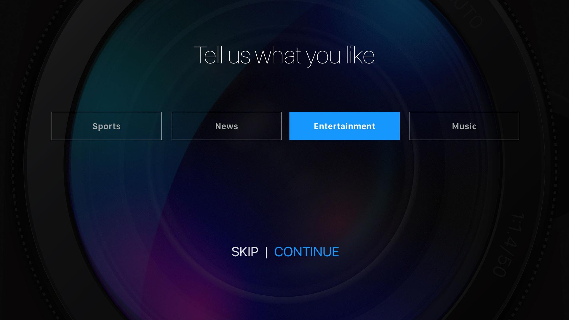
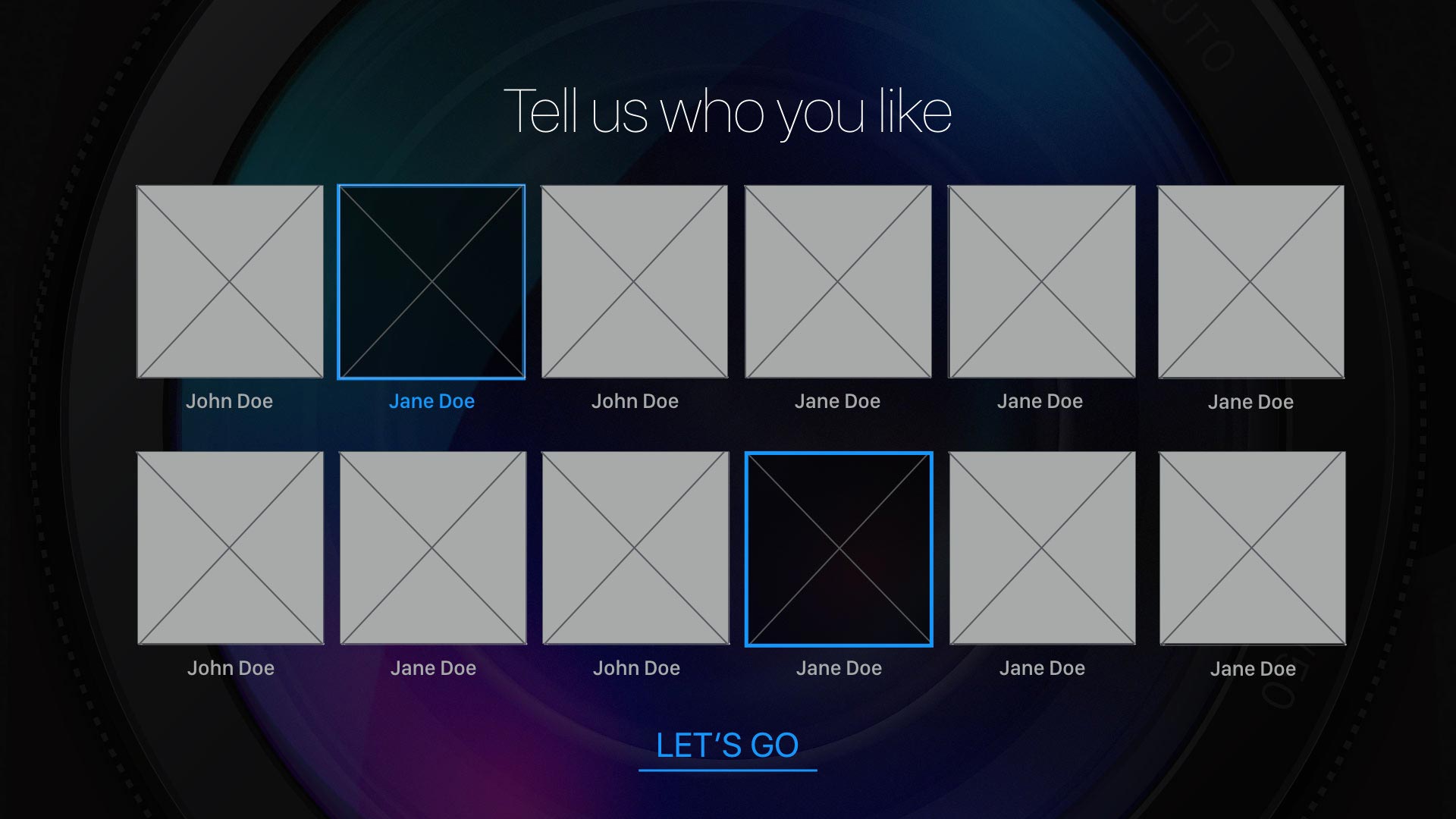
A personalization onboarding in the Favorites section that would not obstruct initial value assessment of the app, is easily dismissible and gives context the location of saved content
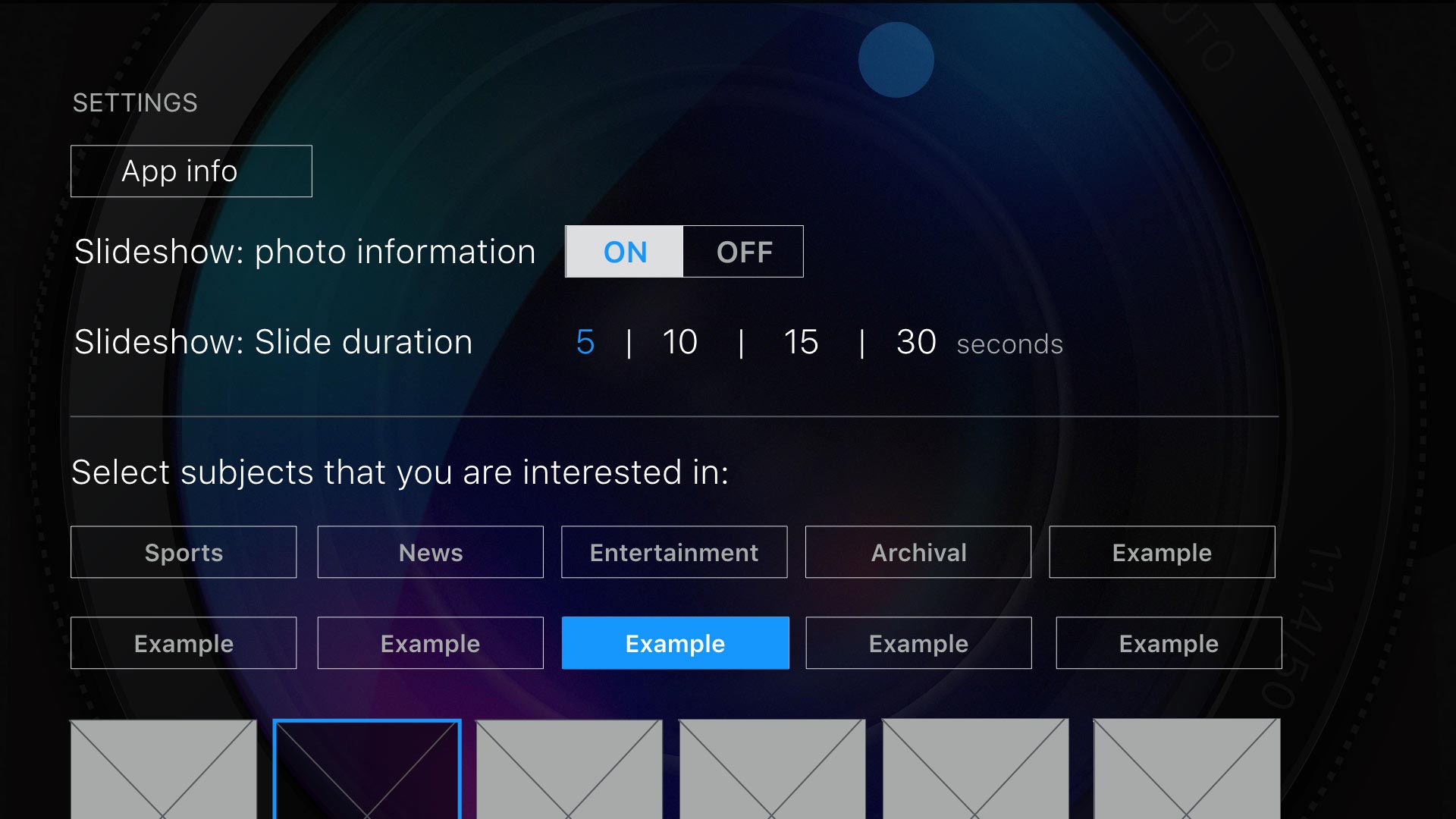
The Settings section gives control of slideshow capabilities, access to future edits of following content and the ability to refresh knowledge of remote controls
Adding related galleries links on images to create a discovery loop and increase dwell time
V1 release sitemap
Block frames (above) were used in Keynote to design the app architecture and interactions.

I created a parallax lens graphic for the app icon, related graphics as well as the app background to give an identifiable element that had context to the app’s content.
POSITIVE REVIEWS & ANALYTICS
In the first few months of the release of the 4th gen Apple TV, the Getty Images app was listed in the “Best New Apps” section of the app store. After 5 or 6 months the app moved to the “Apps We Love” section where it again remained for 6 months or longer. We received positive reviews and our analytics showed that we had exceeded our initial download and dwell time goals. Engagement spiked during large events like the Oscars and downloads remained steady with our highlighted position in the app store. With the Apple TV expanding its ecosystem and user base we saw the need to test user behavior as people became more familiar with the new remote and expanded platform. New apps were also entering the market that helped push the paradigm further and I saw many opportunities to refine our experience as well as add new features.
App Advice review (click to enlarge)
A WALKTHROUGH OF THE APP
USER TESTING AND ITERATION
Throughout the creation of the app and subsequent updates, I worked with our mobile team researcher to perform internal testing in Getty’s research lab which had a suitably contextual environment with a couch and large wall mounted television. A little over a year after release, I requested time to work on a comprehensive update with further research due to advancements in the OS, competitive landscape and increased public familiarity with the Apple TV platform. Working with our Senior Researcher we set up field tests at local bars and performed adaptive interviews on subjects ranging in age from the mid 20’s to early 50’s. Knowing that part of our audience was of a younger demographic with heavy interest in entertainment and sports celebrities, I called in a favor with an old friend and set up a usability study at a Junior High school in the Seattle suburbs with a group of 12-14 year olds. This study turned out to be incredibly valuable with a high contrast between the behaviors of the two groups. Not surprisingly, the Junior High students were immediately adept at the touch pad remote but unlike the older demographic, immediately explored the top menu and gravitated to following/personalization and direct interactions that were otherwise overlooked in previous observations. Considering our research findings, team ideation as well as ongoing updates to the Apple tvOS GUI, I finished the last major overhaul design of the app. Below is a list of the new features, new sitemap and a walkthrough of the final version.
Simplified interface in adherence with Apple GUI tenants of clear and intuitive interactions
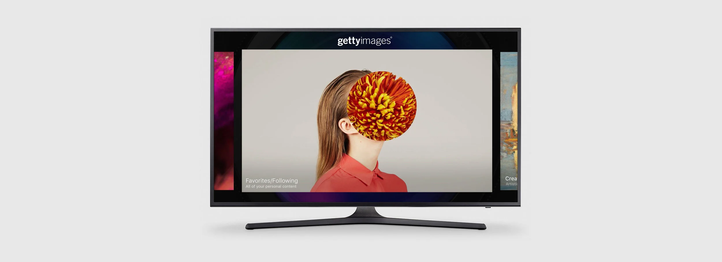
Home page and primary navigation changed to large hero slideshow carousel for a more immersive and passive experience
Enhanced gestures with the remote including new functions related to click and tap as well as interval on screen reminders for new functions
Enhanced Focus and Selection of elements to help with interaction awareness
Added Featured Event gallery as landing element based on engagement analytics showing most heavy engagement for major sports and entertainment events
Added Creative galleries based on research comments for useful and curated creative and pleasant slideshows
Created easier access in hierarchy for Favorites and Following with distinct functions for both to increase engagement
V4 sitemap
My ROLE:
Product design
UX Design: Information architecture, Competitive analysis, User Research, Site mapping, Prototyping
Interaction Design: Interface design, Format research, Visual design, Styleguide and asset management, Developer engagement
BUSINESS GOALS:
Increase brand awareness
Increase interaction with non-business (everyone/unqualified) traffic
Maintain presence in contemporary tech platforms
Create systems for business and advertising expansion